Let’s assume that we have been hired by a winery to build a predictive model to check the qulity of their red wine. The traiditional way of wine testing is done by a human expert. Thus the process is prone to human error. The goal is to establish a process of producing an objective method of wine testing and combining that with the existing process to reduce human error.
For the purpose of building the predictive model, we’ll use a dataset provided by UCI machine learning repository. We’ll try to predict wine quality based on features associated with wine.
Goal:
- Explore the data
- Predict the wine quality (binary classification)
- Explore model result
Exploring Data
Loading data, libraries and primary glimpsing over data
# libraries
library(dplyr)
library(ggplot2)
library(caTools)
library(caret)
library(GGally)
dataFrame = read.csv("https://archive.ics.uci.edu/ml/machine-learning-databases/wine-quality/winequality-red.csv", sep = ';')summary(dataFrame)## fixed.acidity volatile.acidity citric.acid residual.sugar
## Min. : 4.60 Min. :0.1200 Min. :0.000 Min. : 0.900
## 1st Qu.: 7.10 1st Qu.:0.3900 1st Qu.:0.090 1st Qu.: 1.900
## Median : 7.90 Median :0.5200 Median :0.260 Median : 2.200
## Mean : 8.32 Mean :0.5278 Mean :0.271 Mean : 2.539
## 3rd Qu.: 9.20 3rd Qu.:0.6400 3rd Qu.:0.420 3rd Qu.: 2.600
## Max. :15.90 Max. :1.5800 Max. :1.000 Max. :15.500
## chlorides free.sulfur.dioxide total.sulfur.dioxide density
## Min. :0.01200 Min. : 1.00 Min. : 6.00 Min. :0.9901
## 1st Qu.:0.07000 1st Qu.: 7.00 1st Qu.: 22.00 1st Qu.:0.9956
## Median :0.07900 Median :14.00 Median : 38.00 Median :0.9968
## Mean :0.08747 Mean :15.87 Mean : 46.47 Mean :0.9967
## 3rd Qu.:0.09000 3rd Qu.:21.00 3rd Qu.: 62.00 3rd Qu.:0.9978
## Max. :0.61100 Max. :72.00 Max. :289.00 Max. :1.0037
## pH sulphates alcohol quality
## Min. :2.740 Min. :0.3300 Min. : 8.40 Min. :3.000
## 1st Qu.:3.210 1st Qu.:0.5500 1st Qu.: 9.50 1st Qu.:5.000
## Median :3.310 Median :0.6200 Median :10.20 Median :6.000
## Mean :3.311 Mean :0.6581 Mean :10.42 Mean :5.636
## 3rd Qu.:3.400 3rd Qu.:0.7300 3rd Qu.:11.10 3rd Qu.:6.000
## Max. :4.010 Max. :2.0000 Max. :14.90 Max. :8.000From the features we see ‘quality’ is our target feature. And we have total 11 features to be used as the predictors.
Exploring Features
Transforming Target Feature
Since we will cover talk about the classification model, we’ll convert our target feature from continuous to binary class. So that we would be able to fit one of the very widely used yet very easy classification models.
Distribution of original target feature labels
# checking ratio of different labels in target feature
prop.table(table(dataFrame$quality))
##
## 3 4 5 6 7 8
## 0.006253909 0.033145716 0.425891182 0.398999375 0.124452783 0.011257036dataFrame = dataFrame %>%
mutate(quality_bin = as.factor(ifelse(quality <= 5, 0,1))) %>%
select(-quality)
p = round(prop.table(table(dataFrame$quality_bin))*100,2)After tranformation we have 53.47% cases classified records as good wines vs 46.53% as bad wines.
We have a nice distribution of our target classes here! Which is very nice. Otherwise, we would’ve had to deal with Data Balancing. Though we won’t cover that area in this tutorial, it’s a great discussion area to delve into. So some extra points for those who’ll learn about it!
In short, we would like to have a balanced distribution of observations from different labels in our target feature. Otherwise, some ML algorithms tend to overfit.
Exploring Predictors Visually
Exploring acidity
dataFrame %>%
  ggplot(aes(x = as.factor(quality_bin), y = fixed.acidity, color = quality_bin)) +
  geom_boxplot(outlier.color = "darkred", notch = FALSE) +
  ylab("Acidity") + xlab("Quality (1 = good, 2 = bad)") +
  theme(legend.position = "none", axis.title.x = element_blank()) +
  theme_minimal()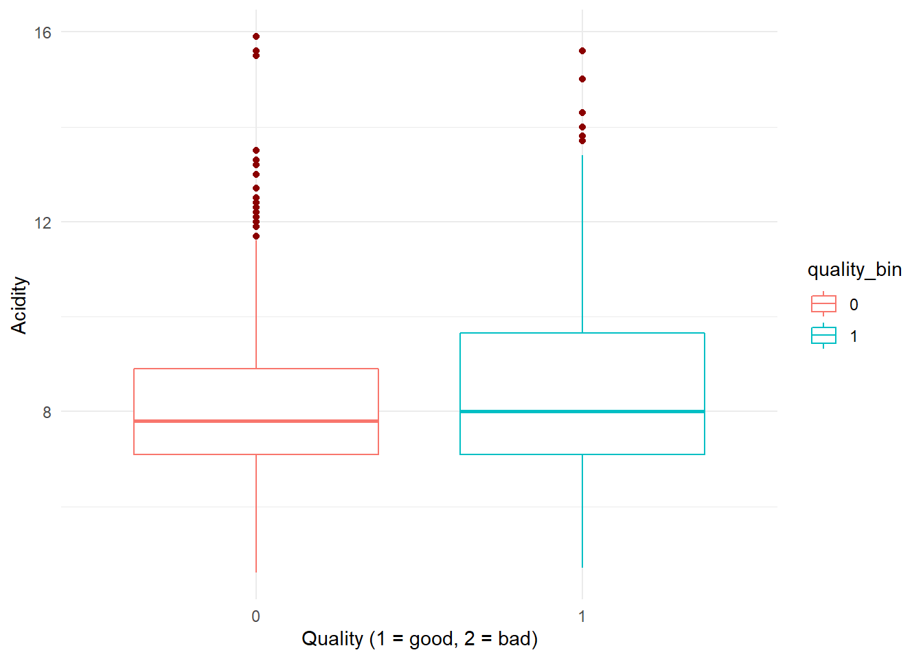
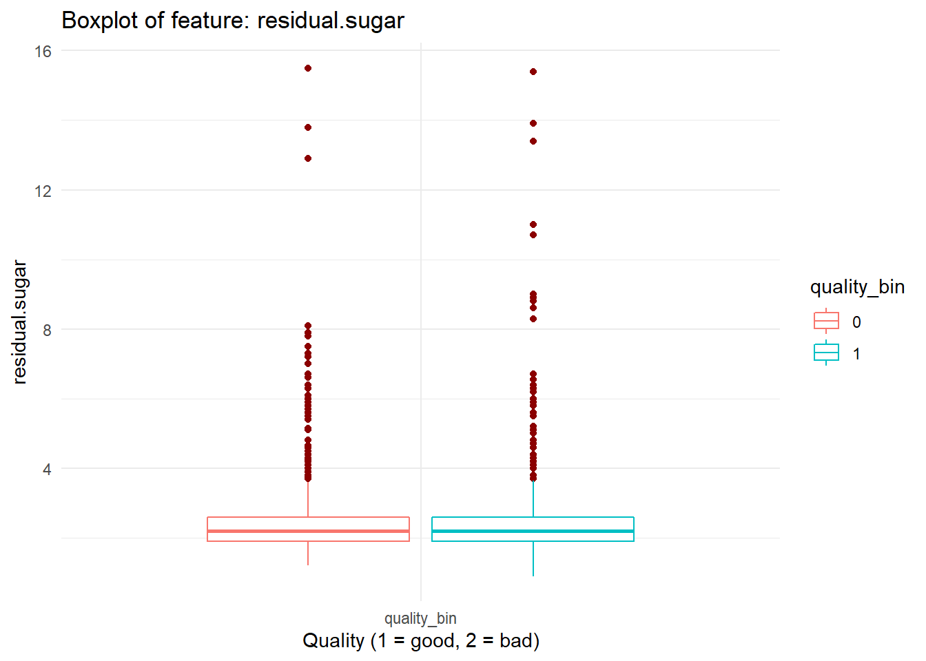
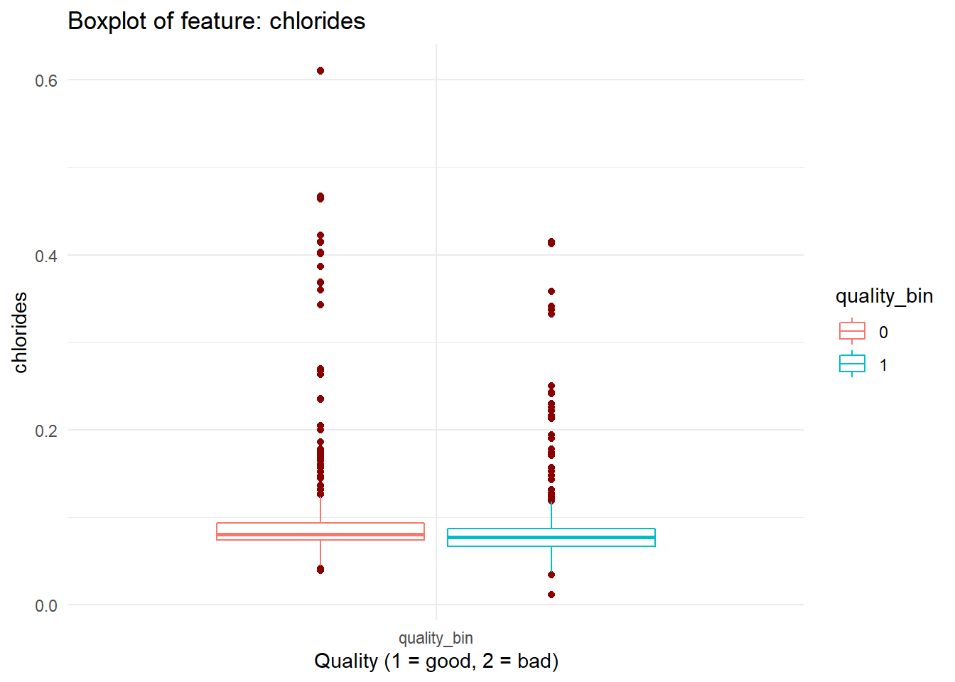
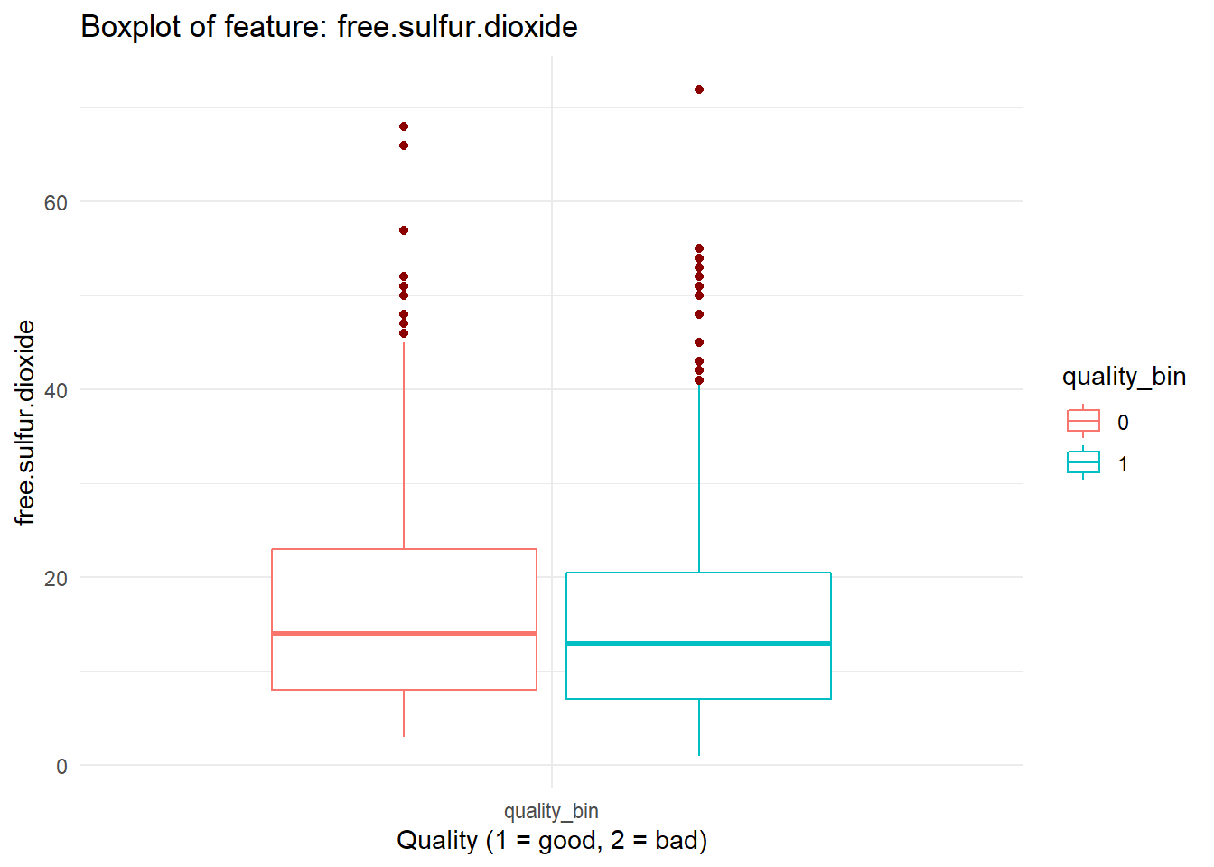
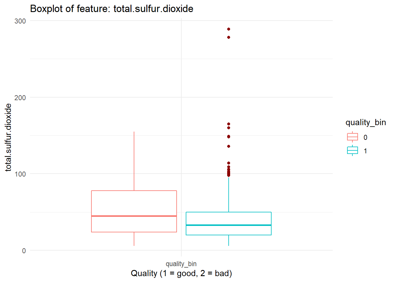
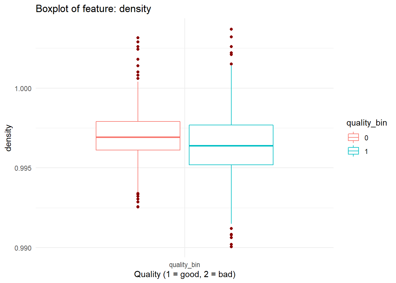
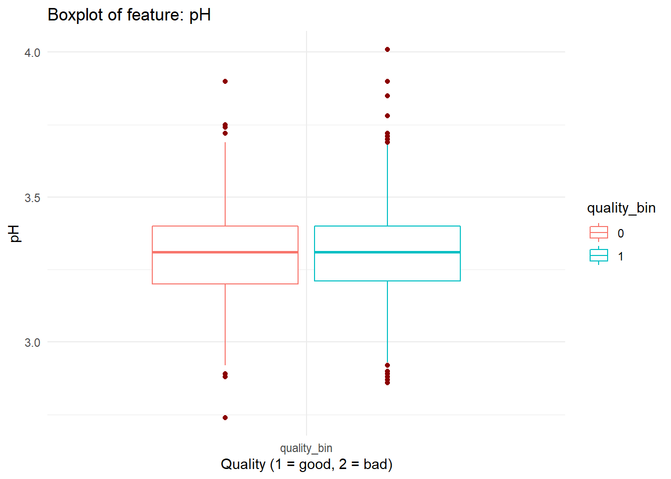
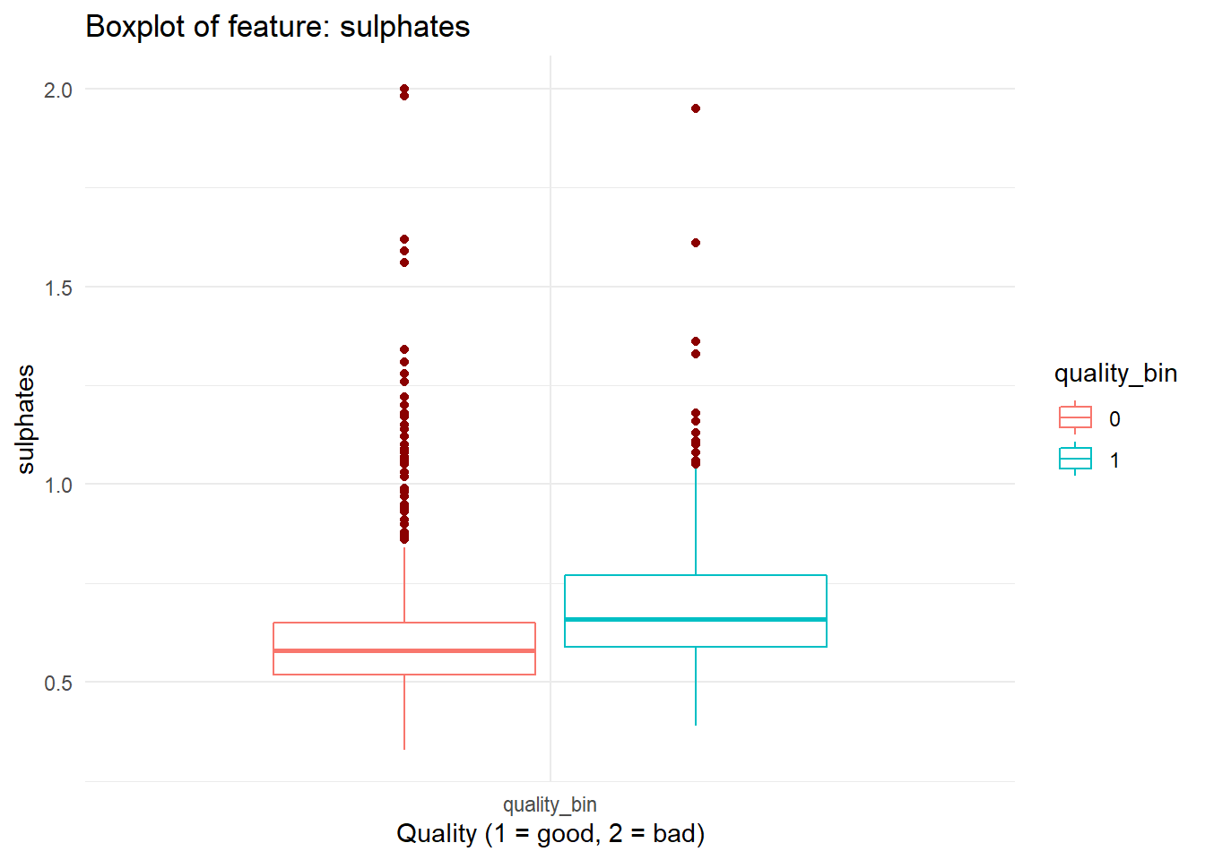
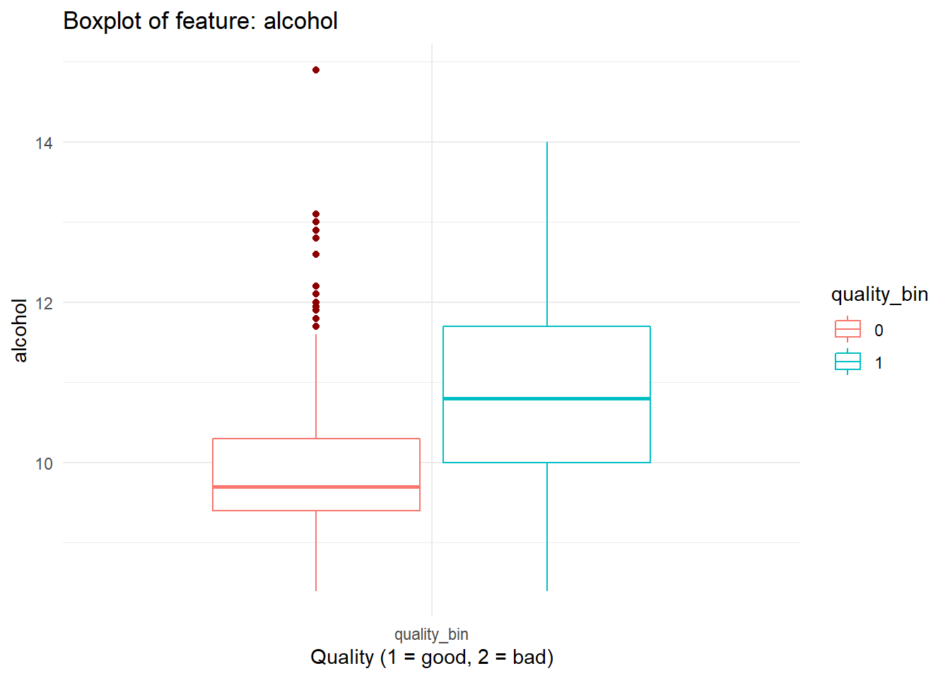
We have multiple features that are continuous and can plot them similarly. Which means we’ll have to re write the code that we have just wrote in code chunk: viz_acidity again and again. In coding, we don’t want to do that. So we’ll create a function and wrap that around our code so that it can be reused in future!
If it sounds too much, just stick with it. Once you see the code, it’ll make a lot more sense.
# boxplot_viz
# plots continuous feature in boxplot categorized on the quality_bin feature labels from dataFrame
# @param feat Feature name (string) to be plotted
boxplot_viz = function(feat){

  dataFrame %>%
    ggplot(aes_string(x = as.factor('quality_bin'), y = feat, color = 'quality_bin')) +
    geom_boxplot(outlier.color = "darkred", notch = FALSE) +
    labs(title = paste0("Boxplot of feature: ", feat)) + ylab(feat) + xlab("Quality (1 = good, 2 = bad)") +
    theme(legend.position = "none", axis.title.x = element_blank()) +
    theme_minimal()
}
boxplot_viz('volatile.acidity')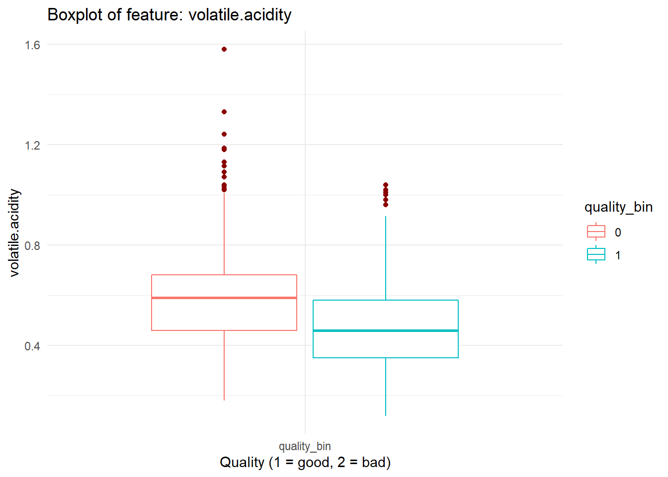
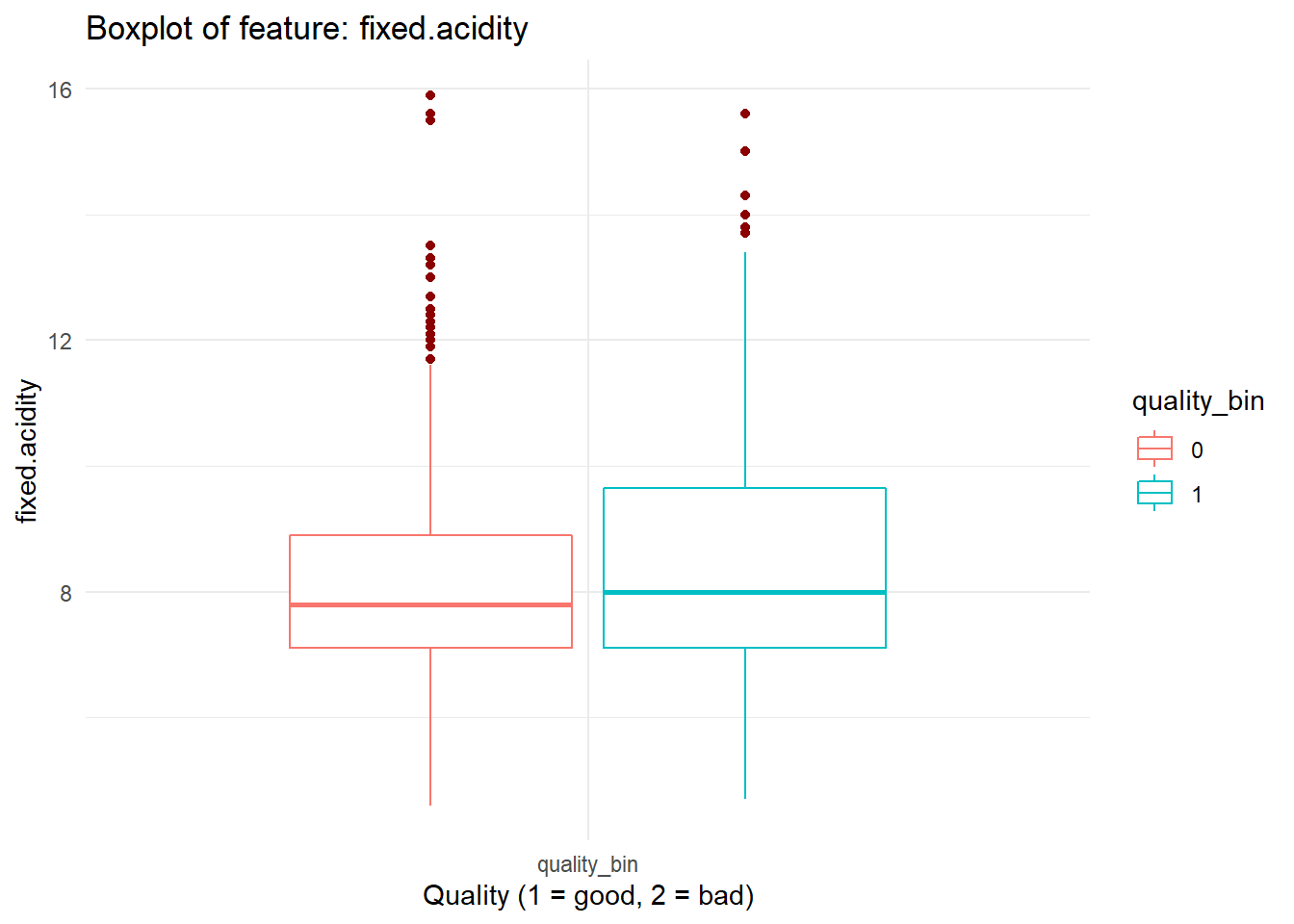
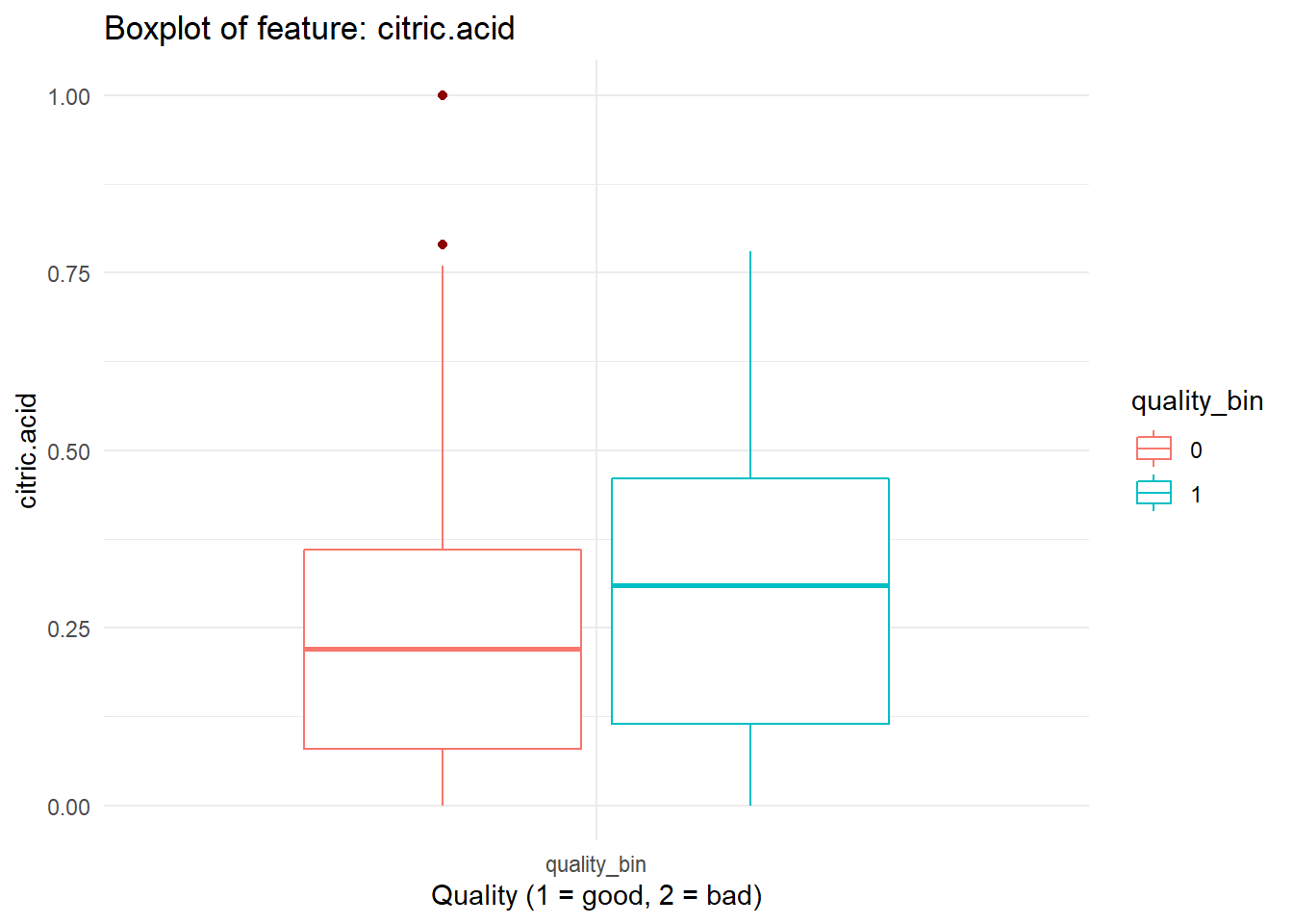
for (i in names(dataFrame %>% select(-'quality_bin'))){
  print(boxplot_viz(i))
}

Checking Correlation
We can quickly check correlations among our predictors.
dataFrame %>%
  # correlation plot
  ggcorr(method = c('complete.obs','pearson'),
         nbreaks = 6, digits = 3, palette = "RdGy", label = TRUE, label_size = 3,
         label_color = "white", label_round = 2)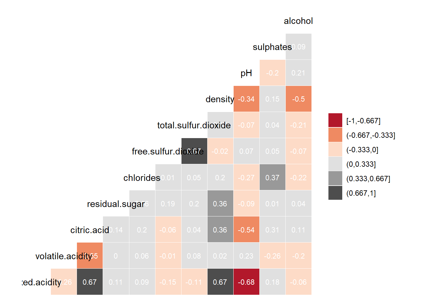
Highly correlated features don’t add new information to the model and blurrs the effect of individual feature on the predictor and thus makes it difficult to explain effect of individual features on target feature. This problem is called Multicollinearity. As a general rule, we don’t want to keep features with very high correlation.
- What should be the threshold of correlation?
- How do we decide which variable to drop?
- Do correlated features hurt predictive accuracy?
All these are great questions and worth having a good understanding about. So again extra points for those who’ll learn about !
Before making any decision based on correlation, check distribution of the feature. Unless any two features have a linear relation, correlation doesn’t mean much.
Feature Engineering
Based on the insight gained from the data exploration, some features may need to be transformed or new features can be created. Some common feature engineering tasks are:
- Normalization and standardization of features
- Binning continuous features
- Creating composit features
- Creating dummy variables
This tutorial won’t cover feature engineering but it’s a great area to explore. A great data exploration followed by necessary feature engineering are the absolute necessary prerequisites before fitting any predictive model!
Fitting Model
Splitting Data
In practical world we train our predictive models on historical data which is called Training Data. Then we apply that model on new unseen data, called Test Data, and measure the performance. thus we can be sure that our model is stable or not over fitted on training data. But since we won’t have access to new wine data, we’ll split our dataset into training and testing data on a 80:20 ratio.
set.seed(123)
split = sample.split(dataFrame$quality_bin, SplitRatio = 0.80)
training_set = subset(dataFrame, split == TRUE)
test_set = subset(dataFrame, split == FALSE)
Let’s check the data balance in training and test data.
prop.table(table(training_set$quality_bin))##
## 0 1
## 0.4652072 0.5347928prop.table(table(test_set$quality_bin))##
## 0 1
## 0.465625 0.534375Fitting Model on Training Data
We’ll fit Logistic Regression classification model on our dataset.
model_log = glm(quality_bin ~ .,
                data = training_set, family = 'binomial')
summary(model_log)
##
## Call:
## glm(formula = quality_bin ~ ., family = "binomial", data = training_set)
##
## Deviance Residuals:
## Min 1Q Median 3Q Max
## -3.3688 -0.8309 0.2989 0.8109 2.4184
##
## Coefficients:
## Estimate Std. Error z value Pr(>|z|)
## (Intercept) 17.369521 90.765368 0.191 0.84824
## fixed.acidity 0.069510 0.112062 0.620 0.53507
## volatile.acidity -3.602258 0.558889 -6.445 1.15e-10 ***
## citric.acid -1.543276 0.638161 -2.418 0.01559 *
## residual.sugar 0.012106 0.060364 0.201 0.84106
## chlorides -4.291590 1.758614 -2.440 0.01467 *
## free.sulfur.dioxide 0.027452 0.009293 2.954 0.00314 **
## total.sulfur.dioxide -0.016723 0.003229 -5.180 2.22e-07 ***
## density -23.425390 92.700349 -0.253 0.80050
## pH -0.977906 0.828710 -1.180 0.23799
## sulphates 3.070254 0.532655 5.764 8.21e-09 ***
## alcohol 0.946654 0.120027 7.887 3.10e-15 ***
## ---
## Signif. codes: 0 '***' 0.001 '**' 0.01 '*' 0.05 '.' 0.1 ' ' 1
##
## (Dispersion parameter for binomial family taken to be 1)
##
## Null deviance: 1766.9 on 1278 degrees of freedom
## Residual deviance: 1301.4 on 1267 degrees of freedom
## AIC: 1325.4
##
## Number of Fisher Scoring iterations: 4Let’s plot the variables with the lowest p values/highest absolute z value.
p = varImp(model_log) %>% data.frame()
p = p %>% mutate(Features = rownames(p)) %>% arrange(desc(Overall)) %>% mutate(Features = tolower(Features))

p %>% ggplot(aes(x = reorder(Features, Overall), y = Overall)) + geom_col(width = .50, fill = 'darkred') + coord_flip() +
  labs(title = "Importance of Features", subtitle = "Based on the value of individual z score") +
  xlab("Features") + ylab("Abs. Z Score") +
  theme_minimal()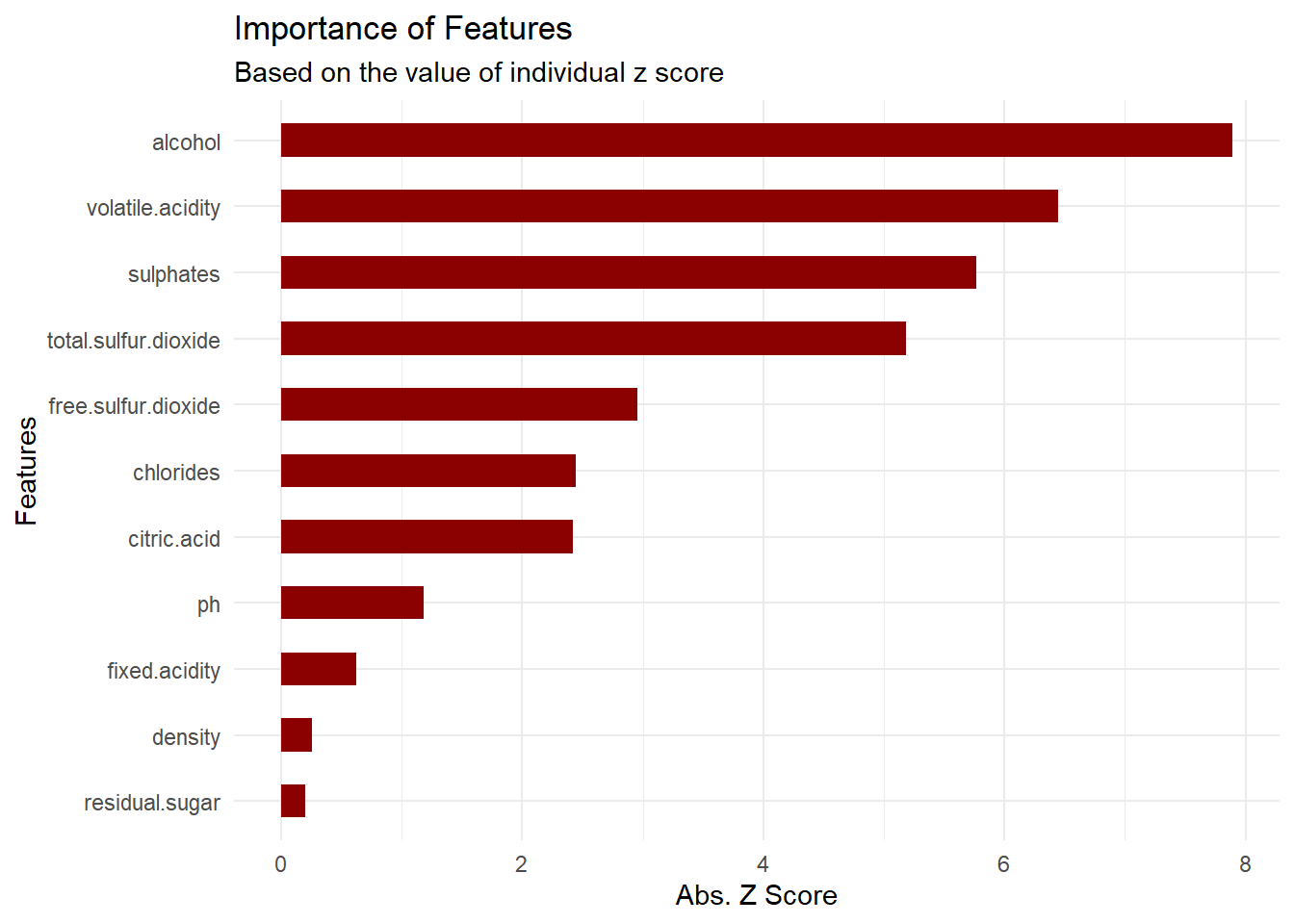
Checking Model Performance
We’ll check how our model performs by running it on our previously unseen test data. We’ll compare the predicted outcome with the actual outcome and calculate some typically used binary classification model performance measuring metrics.
# predict target feature in test data
y_pred = as.data.frame(predict(model_log, type = "response", newdata = test_set)) %>%
  structure( names = c("pred_prob")) %>%
  mutate(pred_cat = as.factor(ifelse(pred_prob > 0.5, "1", "0"))) %>%
  mutate(actual_cat = test_set$quality_bin)
p = confusionMatrix(y_pred$pred_cat, y_pred$actual_cat, positive = "1")
p## Confusion Matrix and Statistics
##
## Reference
## Prediction 0 1
## 0 108 46
## 1 41 125
##
## Accuracy : 0.7281
## 95% CI : (0.6758, 0.7761)
## No Information Rate : 0.5344
## P-Value [Acc > NIR] : 9.137e-13
##
## Kappa : 0.4548
##
## Mcnemar's Test P-Value : 0.668
##
## Sensitivity : 0.7310
## Specificity : 0.7248
## Pos Pred Value : 0.7530
## Neg Pred Value : 0.7013
## Prevalence : 0.5344
## Detection Rate : 0.3906
## Detection Prevalence : 0.5188
## Balanced Accuracy : 0.7279
##
## 'Positive' Class : 1
## Model Perfomance Summary:
- Accuracy: 72.81% of the wine samples have been classified correctly.
- Sensitivity/Recall: 73.1% of the actual good wine samples have been classified correctly.
- Pos Pred Value/Precision: 75.3% of the total good wine predictions are actually good wines.
Summary Inisght
So let’s summarize about what we have learned about wine testing from our exercise:
- Alchohol content, Volatile Acidity, Sulphate and total Sulpher Dioxide are the top four most statistically significant features that affect wine quality.
- Given the information about the 11 features that we have analyzed, we can accurately predict wine quality in about 73% of the cases,
- Which is about 26% more accurate than the accuracy achieved by using traditional expert based method.

comments powered by Disqus Comment