Part 01: Background about this project
This analysis is part of an ongoing exploratory study about the contents related to Bangladesh in different online social media platforms. In the last article tweets that containing Bangladesh were analyzed to understand the most common areas that people tweeted about Bangladesh and how public sentiments were reflected. In this article a similar study will be conducted on the videos shared on Youtube that have Bangladesh in their titles. To collect the data YouTube’s publicly available API will be used. Along with the video stats, comments posted by viewers will also be fetched and analyzed.
The analysis is segmented broadly into two phases:
- Extracting insights from the overall statistics of the videos and
- Extracting insights from the unstructured data (e.g. comments) by applying different text analytics techniques.
Some of the key goals of this analysis are to see:
- What kind of videos are posted?
- Is there any trend in the number of video posted with the time when they are posted?
- What kind of videos are mostly liked and disliked?
- Which videos get most traction with their viewers?
- Videos around which topics are mostly posted?
- Do the trend of video posting vary based on different types of videos?
- How do people react or express their sentiment in the comment section?
- Do sentiment change over the time?
Part 02: Data collection
The required data for this analysis has been scraped using public API provided by YouTube. Time line considered is the whole year (2017-2018). Scraping YouTube produced a pool of 585 unique videos which have Bangladesh mentioned in their titles. These videos were posted from total 377 different channels. An easy to follow step by step process of how to connect with YouTube using tuber package can be found in this link: https://www.youtube.com/watch?v=NEh5N3OZCXc and the codes used to scrape data for this project can be seen by un-hiding the following code chunk.
# credentials
app_id = 'Your_app_id'
app_secret = 'your_app_secret'
# establishing connecting with YouTube
yt_oauth(app_id = app_id, app_secret = app_secret)

# ---fetching YouTube videos with 'bangladesh' in the title---
# searching for videos that have 'Bangladesh' in the title
videos_year <- yt_search("Bangladesh", published_after = "2017-6-01T00:00:00Z", published_before = "2018-1-1T00:00:00Z")
# fetching video statistics for all videos (2017-2018)
videostats = lapply(as.character(videos_year$video_id), function(x){
  get_stats(video_id = x)
})
df = ldply(videostats, data.frame)

# merging videos stats with the main file:  videos_year
colnames(df)[1] = 'video_id' # renaming 'id' as video_id so that it matches same coluimn in main table
videos_year = videos_year %>% left_join(df, by = 'video_id')

# correcting data type
videos_year[,c('viewCount', 'likeCount', 'dislikeCount', 'favoriteCount', 'commentCount')]=apply(videos_year[,c('viewCount', 'likeCount', 'dislikeCount', 'favoriteCount', 'commentCount')],2,as.numeric)
# write.csv(videos_year,'youtube_video_raw+stat_2017-2018.csv', row.names = FALSE)
Part 03: Data cleaning
In the last part we have collected video specific statistics and compiled all in a single file named videos_year. A look into the file reveals that it contains 589 observations/rows and 21 variables/columns. Or in other words we have 21 different attributes collected for each of the videos. To look at the variables some basic summary codes have been run and the results are shown below:
videos_year = read.csv('../../../source_files/youtube_video_raw+stat_2017-2018.csv')
dim(videos_year)
## [1] 589 21names(videos_year)## [1] "video_id" "publishedAt"
## [3] "channelId" "title"
## [5] "description" "thumbnails.default.url"
## [7] "thumbnails.default.width" "thumbnails.default.height"
## [9] "thumbnails.medium.url" "thumbnails.medium.width"
## [11] "thumbnails.medium.height" "thumbnails.high.url"
## [13] "thumbnails.high.width" "thumbnails.high.height"
## [15] "channelTitle" "liveBroadcastContent"
## [17] "viewCount" "likeCount"
## [19] "dislikeCount" "favoriteCount"
## [21] "commentCount"From the variable names we can see that there are data (e.g. thumbnails related data) that are out of scope of this analysis. We can take a look at the summary statistics of the other variables to have an idea about the necessary data cleaning.
str(videos_year[c('publishedAt','channelId','title','description','channelTitle',
                  'liveBroadcastContent','viewCount','likeCount','dislikeCount', 'favoriteCount','commentCount')])
## 'data.frame': 589 obs. of 11 variables:
## $ publishedAt : chr "2017-07-27T22:21:56.000Z" "2017-10-27T15:37:33.000Z" "2017-11-22T14:59:50.000Z" "2017-07-04T06:18:32.000Z" ...
## $ channelId : chr "UCNye-wNBqNL5ZzHSJj3l8Bg" "UCXulruMI7BHj3kGyosNa0jA" "UCXulruMI7BHj3kGyosNa0jA" "UCqlc8Q5Rixjp_zTePTI_mRg" ...
## $ title : chr "<f0><U+009F><U+0087><U+00A7><f0><U+009F><U+0087><U+00A9> Bangladesh's Biggest Brothel | 101 East | <U+092C><U+0"| __truncated__ "HELLO BANGLADESH. DHAKA IS CRAZY." "HOW EXPENSIVE IS BANGLADESH? <f0><U+009F><U+0092><U+00B0><f0><U+009F><U+0087><U+00A7><f0><U+009F><U+0087><U+00A9>" "Bangladesh Biman With CG For Sefty" ...
## $ description : chr "The biggest brothel in Bangladesh - and possibly the world. The town of Daulatdia is home to 1500 prostitutes, "| __truncated__ "VLOG #146. Let me know your thoughts in the comments section PATREON: https://www.patreon.com/indigotraveller o"| __truncated__ "INSTAGRAM - https://www.goo.gl/hvrnHZ FACEBOOK - https://www.goo.gl/98tqkZ VLOG #156. Let me know your thoughts"| __truncated__ "" ...
## $ channelTitle : chr "Al Jazeera English" "Indigo Traveller" "Indigo Traveller" "Bhaishob Media" ...
## $ liveBroadcastContent: chr "none" "none" "none" "none" ...
## $ viewCount : int 10456088 297082 400570 2867726 1098161 745213 901613 586726 17040399 249231 ...
## $ likeCount : int 21569 6862 12307 13686 7964 16885 6824 2551 67524 2696 ...
## $ dislikeCount : int 5862 463 361 1553 732 521 747 560 10818 482 ...
## $ favoriteCount : int 0 0 0 0 0 0 0 0 0 0 ...
## $ commentCount : int 5478 3530 3446 432 342 4243 2024 133 2978 392 ...Looking at summary stat of other variabes we can identify these issues: 1. Variable publishedA’ contains date data in a wrong format. Which needs to be changed into date format for convenience of future analysis. 2. Variables containing text data ( title and description) need text cleaning since they have HTML codes which don’t have any value in terms of generating meaningful insight In the next three code chunks, these two issues will be fixed.
# converting into data type 'date'
videos_year$publishedAt = as.Date(videos_year$publishedAt)
str(videos_year$publishedAt)
## Date[1:589], format: "2017-07-27" "2017-10-27" "2017-11-22" "2017-07-04" "2017-08-24" ...# creating new variables 'year' and 'month'
videos_year = videos_year %>% mutate(month = month(publishedAt)) %>% mutate(year = year(publishedAt))From above results we can see that data type of variabled named publishedAt has been converted to ‘date’. Two new variables named year and month have been created from the publishedAt variable to use in future analysis. Now we will move on to cleaning the text values in title variable.
head(videos_year$title,5)## [1] "<f0><U+009F><U+0087><U+00A7><f0><U+009F><U+0087><U+00A9> Bangladesh's Biggest Brothel | 101 East | <U+092C><U+093E><U+0902><U+0917><U+094D><U+0932><U+093E><U+0926><U+0947><U+0936> <U+0915><U+0940> <U+0938><U+092C><U+0938><U+0947> <U+092C><U+0921><U+093C><U+0940> <U+0935><U+0947><U+0936><U+094D><U+092F><U+093E><U+0932><U+092F>"
## [2] "HELLO BANGLADESH. DHAKA IS CRAZY."
## [3] "HOW EXPENSIVE IS BANGLADESH? <f0><U+009F><U+0092><U+00B0><f0><U+009F><U+0087><U+00A7><f0><U+009F><U+0087><U+00A9>"
## [4] "Bangladesh Biman With CG For Sefty"
## [5] "Bangladesh Beats West Indies all out for 61 runs (Lowest Score ever)"The first 10 titles shown above show the uncleaned raw labels or video titles that exist now in the dataset. And the 5 titles shown below are the cleaned titles after cleaning the raw titles using different regular expressions.
# cleaning video titles
videos_year$title= gsub("<.*?>","", videos_year$title) #removing html tags
videos_year$title= gsub("[[:punct:]]", " ", videos_year$title) #removing html tags
videos_year$title = gsub("[ |\t]{2,}", " ", videos_year$title)  # Remove tabs
videos_year$title = gsub("^ ", "", videos_year$title)  # Leading blanks
videos_year$title = gsub(" $", "", videos_year$title)  # Lagging blanks
videos_year$title = gsub(" +", " ", videos_year$title) # General spaces
videos_year$title = tolower(videos_year$title) # lowering all letters
head(videos_year$title,5)
## [1] "bangladesh s biggest brothel 101 east"
## [2] "hello bangladesh dhaka is crazy"
## [3] "how expensive is bangladesh"
## [4] "bangladesh biman with cg for sefty"
## [5] "bangladesh beats west indies all out for 61 runs lowest score ever"At this stage, before enterign into the data analysis we’ll create three more variables that contain the ratios of likes, dislikes and comments against the total views of respective video. Having this ratios will help us in future to extract insights without bias by considering ratios rather than the absolute numbers.
# creating like, dislike, comment ratio
videos_year = videos_year %>%
  mutate(like_ratio = likeCount/viewCount) %>%
  mutate(dislike_ratio = dislikeCount/viewCount) %>%
  mutate(comment_ratio = commentCount/viewCount) %>%
  mutate(ratio_to_total = viewCount/sum(viewCount, na.rm = TRUE))

# names(videos_year)
Part 04: Data analysis
To start off, we can look at some basic statistics such as monthly video posting frequency, most viewed, liked, disliked and commented videos and so on.
#month wise video posting (data = videos_year)
videos_year %>%
  group_by(factor(month)) %>%
  mutate(total = n()) %>%
  ungroup() %>%
  ggplot(aes(x = month, y = total)) +
  geom_line(color = "#27408b") +
  geom_point(shape=21,fill="white",color="#27408b",size=3,stroke=1.1) +
  scale_x_continuous(breaks = seq(1,12,1), labels = c("Jan","Feb","Mar","Apr","May",
                                                      "Jun","Jul","Aug","Sep","Oct",
                                                      "Nov","Dec")) +
  labs(x="Month",y="Number of videos",
       title="Month wise frequency of video posting",
       subtitle="subtitle = 'Year 2017 to 2018'")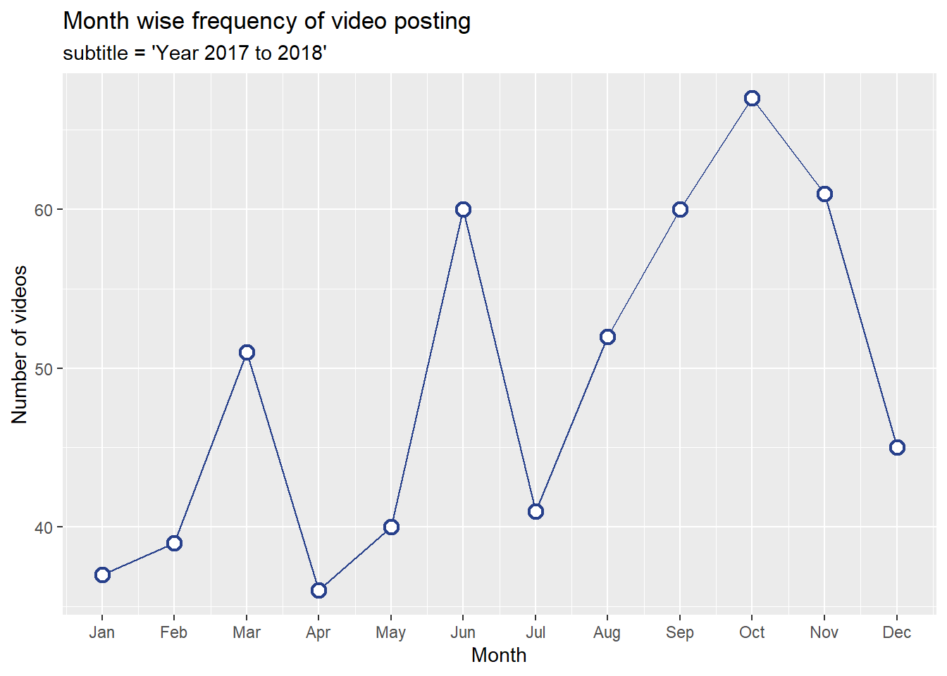
From above chart we can see that there was a growing trend starting from August which reached at its peak in October and then again gradually fell. Other than August the other two months with unusual spikes are March and June. Now let’s look at the most viewed videos and also see in which month they were posted.
# most viewed videos
videos_year %>% arrange(desc(viewCount)) %>% head(20) %>%
  mutate(title = strtrim(title, 25)) %>%
  mutate(title = reorder(title,viewCount)) %>% top_n(20) %>%
  ggplot(aes(as.factor(title), (viewCount/1000000), fill = factor(month))) +
  geom_col()  +
  scale_x_discrete() +
  coord_flip() +
  ggtitle(label = 'Top 20 most viewed videos') +
  xlab(label = 'Video title') +
  ylab(label = 'Number of views (in millions)') +
  labs(fill = 'Month', caption = '* Video titles have been truncated')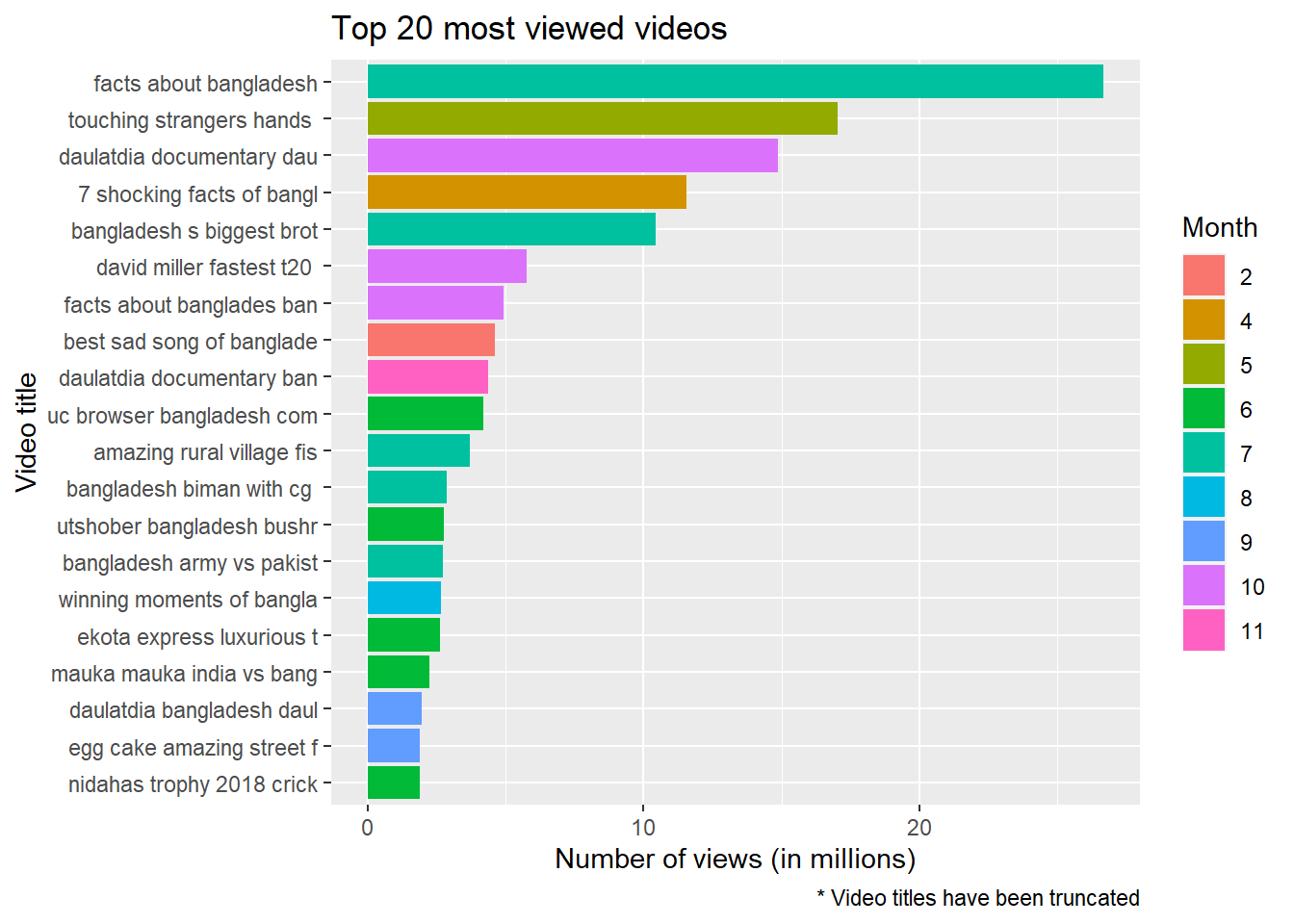
From the abundance of paste and green color in the above plot we can immediately tell that most of the most viewed viewed videos were posted during the month of June and July. In addition to that some other observations can also be made from this plot:
- There is a wide dispersion among the videos in terms of count ofviews. The highest viewed video has a quite a large gap from the second most viewed video. And a similar gap is observed between the other videos too. Which means the ratio variables created earlier during data cleaning and feature engineering stage will come handy in further analysis by helping us overcome the imbalance in the absolute numbers.
- Similar to what we have seen during the analysis of tweets regarding Bangladesh, there are multiple videos related to Cricket in this list of top 20 most viewed videos.
- But unlike the last analysis there are multiple videos, including two out of the top five, about brothel in Bangladesh. To understand the reason a manual inspection of the related videos reveals that all the three videos in the top 20 videos are about a specific brothel situated in a small town called Doulatdia in the southern part of Bangladesh. But why would that brothel be a center of attraction for YouTubes? The answer can be found from a closer look at the top three viewed videos. Aljazeera, a middle eastern news channel published a documentary in June, which is the fifth most viewed video on this brothel. The rest of the two videos were posted from another channel with no credible record like Aljazeera.
So what are the other videos about? We already have got a basic understanding on what the top viewed videos were about. Now to have a deeper understanding about the common discussion areas of all the videos, we will use different key word extraction techniques for this purpose.
As a first step, let’s transform our text data into a matrix, more precisely a ‘Document Term Matrix’. Where each word in the text corpus is separated and columns are created for each of these words. Then each sentence is plotted as a row and the columns containing words that are in each docs/sentece get a score of 1 and others 0. Which eventually creates a sparse matrix with lots of zeros. In our case the sparsity is really high (very close to 100%) meaning that there are lots of zeros or in other words there is a wide variety in the titles of the videos.
videos_year$title = removeWords(as.character(videos_year$title), stopwords('english'))
videos_year_title <- enc2utf8(videos_year$title)
corpus = Corpus(VectorSource(videos_year_title))

dtm = DocumentTermMatrix(corpus)
dtm
## <<DocumentTermMatrix (documents: 589, terms: 1552)>>
## Non-/sparse entries: 3715/910413
## Sparsity : 100%
## Maximal term length: 23
## Weighting : term frequency (tf)doc.length = apply(dtm, 1, sum)
dtm = dtm[doc.length > 0,]
inspect(dtm[10:11,])## <<DocumentTermMatrix (documents: 2, terms: 1552)>>
## Non-/sparse entries: 13/3091
## Sparsity : 100%
## Maximal term length: 23
## Weighting : term frequency (tf)
## Sample :
## Terms
## Docs aprilia bangladesh bikes border dhaka eskaton expensive ktm new road
## 10 1 1 1 0 1 1 1 1 1 1
## 11 0 1 0 1 0 0 0 0 0 0From above we can see a summary of our document term matrix. Which shows sparsity of 100% (which should be very close to 100 not exactly 100). We can take a look at some of the sentences in from the matrix. Above 10th and 11th sentences have been fetched as example. We can see that 10th sentence contains all the words except ‘border’ while 11th sentence contains only two words ‘bangladesh’ and ‘border’ from the columns that were fetched as an example.
Now let’s take a look at the most frequently used words.
freq = colSums(as.matrix(dtm))
length(freq)
## [1] 1552ord = order(freq, decreasing = TRUE)
freq[head(ord, n = 20)]## bangladesh 2017 dhaka india top company
## 614 106 45 44 39 39
## skydance dance rohingya performance wedding match
## 38 36 34 32 30 29
## world new bangla army myanmar news
## 25 23 19 19 18 17
## price video
## 15 14Bangladesh and 2017 are the top two most frequent words for obvious reason. The third most frequent word is Dhaka, the capital of Bangladesh. Interestingly we see a similar trend here as we have seen in the our last analysis about tweets, there are quite an interest about the neighboring countries. In this case we see videos that have mentions of India and Myanmar. Also we see rohingya is one of the most frequent words here too. There is a seemingly unusual prevalence of dance related words can be observed among the most frequent words. Looking at the words correlation may give us a better understanding.
#library 'tibble' provides the rowname_to_columns to name row names column
df1=as.data.frame(findAssocs(dtm,'rohingya',.24)) %>% rownames_to_column("words")
df2=as.data.frame(findAssocs(dtm,'dhaka',.24)) %>% rownames_to_column("words")
df3=as.data.frame(findAssocs(dtm,'dance',.30)) %>% rownames_to_column("words")
df4=as.data.frame(findAssocs(dtm,'india',.28)) %>% rownames_to_column("words")
df5=as.data.frame(findAssocs(dtm,'myanmar',.24)) %>% rownames_to_column("words")
df6=as.data.frame(findAssocs(dtm,'match',.40)) %>% rownames_to_column("words")

#correlation values have been varied intentionally to restrict the number of outputs

df = df1 %>% full_join(df2, by = 'words') %>% full_join(df3, by = 'words') %>% full_join(df4, by = 'words') %>% full_join(df5, by = 'words')  %>% full_join(df6, by = 'words')
df = gather(df, "key",'n',2:7)
df %>% ggplot(aes(words, n, fill = factor(key))) + geom_col() + coord_flip() +
  labs(x = "Counts", y = "Words", fill = "Topic", title = "Topic wise most frequent words")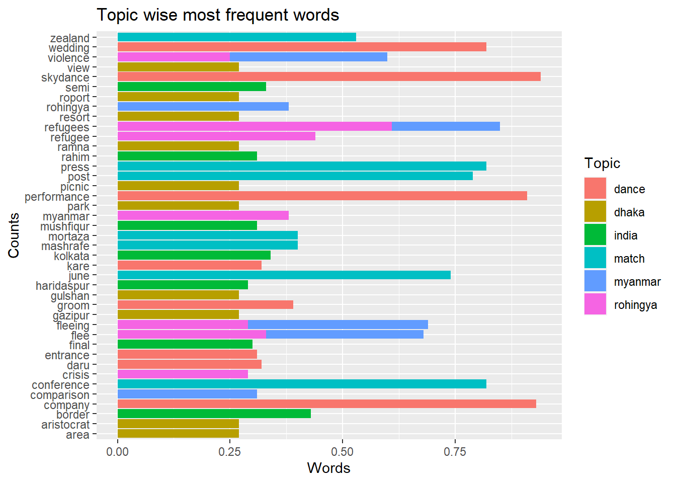
We have used different levels of correlations randing from 0.24 to 0.40 to restrict our correlated words less than 10 for each key word. Now we have a clearer picture of how our most frequent words relate with other words. Myanmar has come into the scenario mostly because of the issue of Rohingya crisis and discussions related to India were related to border issues and cricket. Dhaka’s, the capital of Bangladesh, correlation with words relatd to area and parks may mean that the videos are mostly about the rcreational areas around Dhaka.
We can also see that these words: skydance, company, wedding, performance very highly correlate (above 0.90) with dance. Which reveals that the videos are most likely about wedding dance from some group called Skydance. Let’s look at the names of the channels that have posted most numbers of videos which may give us some new insight.
videos_year %>% count(channelTitle) %>% arrange(desc(n)) %>%
  mutate(channelTitle = reorder(channelTitle, n)) %>% head(10) %>%
  ggplot(aes(channelTitle, n)) +
  geom_col()  +
  scale_x_discrete() +
  coord_flip() +
  ggtitle(label = 'Top 10 chennels with most video uploads') +
  xlab(label = 'Channel name') +
  ylab(label = 'Number of videos') +
  labs(fill = 'Ratio to the total video posted')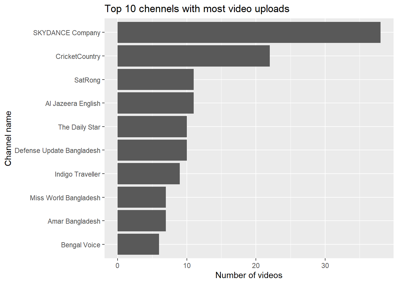
As we have assumed before, we can see that the channel named ‘Skydance company’ posted the highest number of videos (more than 30) and their high number of videos on wedding program has pushed the the words ‘dancing’, ‘wedding’, ‘performance’ to the list of most frequent words.
Among the other top video posters, presence of two news channels (Al Jazeera and Daily Star, a local one) shows that Bangladesh has got quite a good coverage from the news agencies. It would have been nice to see how Bangladesh is represented in these news videos but in this analysis we won’t focus on news. Maybe this can be a future project to work on! But before moving further into the text mining area we will take a look into the numbers of likes, dislikes and comments to find answers to some of the questions that we asked at the beginning of our analysis: - What are the most liked videos? - What are the most disliked videos? - And which videos got most traction with the viewers through comments?
library(grid)
library(gridExtra)
## Warning: package 'gridExtra' was built under R version 4.0.3p1=videos_year %>% arrange(desc(likeCount)) %>% head(10) %>%
mutate(title = strtrim(title, 25)) %>%
mutate(title = reorder(title,likeCount)) %>%
ggplot(aes(title, likeCount)) + geom_col()+ xlab(label="")+ ggtitle(label = 'Top 10 most liked videos') + theme(axis.text.x=element_text(angle=45,hjust=1))
p2=videos_year %>% arrange(desc(dislikeCount)) %>% head(10) %>%
mutate(title = strtrim(title, 25)) %>%
mutate(title = reorder(title,dislikeCount)) %>%
ggplot(aes(title, dislikeCount)) + geom_col() + xlab(label = "")+ ggtitle(label = 'Top 10 most disliked videos') + theme(axis.text.x=element_text(angle=45,hjust=1)) +
labs(caption = '* Video titles have been truncated')
grid.arrange(p1,p2, ncol = 2)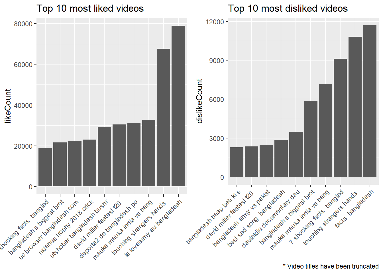
Interrestingly enough, looking at the lists of 10 most liked and disliked videos we can see some common names! Four out of the ten videos are in the both list of highest liked and disliked videos. Another interesting finding is that the videos with most likes and disliked in the list are made in language other than Bangla, national language of Bangladesh. From that it can be safely assumed that the videos were created by non-Bangladeshi people.
Let’s dig deeper into the relationship between likes and dislikes. We can look at the correlationship between likes and dislikes from a scatter plot.
p1=videos_year %>%
  ggplot(aes(likeCount,dislikeCount)) +
  geom_jitter(alpha = 0.4, shape = 1) +
  labs(subtitle = 'All records') +
  xlab(label = 'Count of likes') + ylab(label = 'Count of dislikes')

quantile(videos_year$likeCount, na.rm = TRUE)
## 0% 25% 50% 75% 100%
## 0.0 43.5 268.0 1241.0 78914.0quantile(videos_year$dislikeCount, na.rm = TRUE)## 0% 25% 50% 75% 100%
## 0.0 4.0 32.0 136.5 11703.0p2=videos_year %>% filter(likeCount <= 1241 & likeCount >= 44 & dislikeCount <= 137 & dislikeCount >= 4) %>%
ggplot(aes(likeCount,dislikeCount)) +
geom_jitter(alpha = 0.4, shape = 1) +
labs(subtitle = 'Both lowest and highest quantile values removed') +
xlab(label = 'Count of likes') + ylab(label = 'Count of dislikes')
grid.arrange(p1,p2, ncol = 2, top = 'Likes vs Dislikes')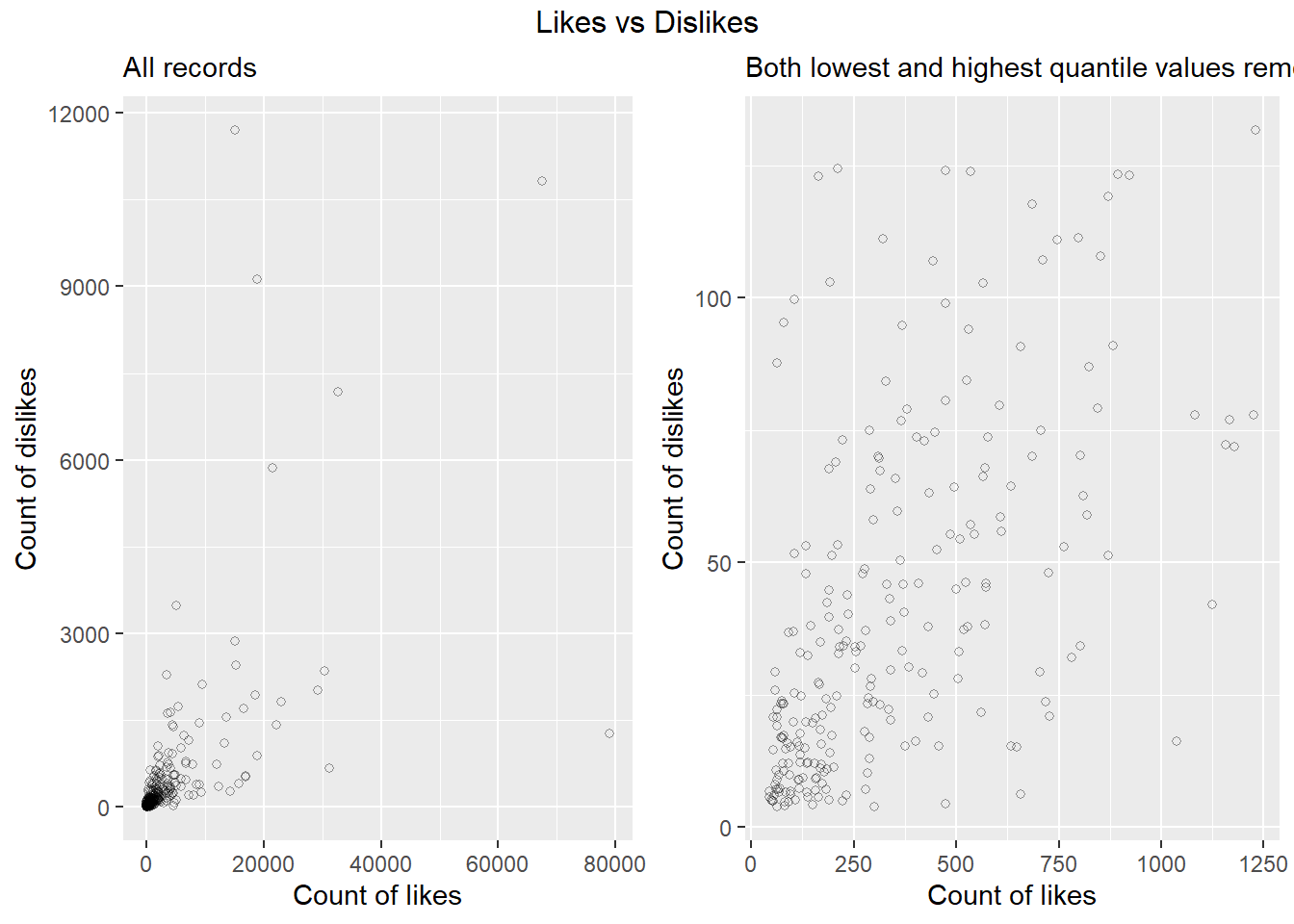
The left chart above represents all the videos. From the high density in the bottom left corner, we can clearly see the high degree of skewness in the data. Which means that there is high level of disparity among the videos in terms of the number of likes and dislikes. Which is similar to what we have observed in case of number of views.
So to overcome this clutter and derive more meaningful insight extreme values from both the lowest and highest extremes (lowest and highest quantile values) were considered only. Looking at the scatter plot in right now we can observe a somewhat linearity can assumed between number of likes and dislikes.Statistically which can be seen from their correlation of 0.64. Which means in 64% of the cases high number of likes co-occur with the high number of dislikes and vice versa.
Now let’s look at the number of comments.
videos_year %>% arrange(desc(commentCount)) %>% head(10) %>%
    mutate(title = strtrim(title, 25)) %>%
  mutate(title = reorder(title, commentCount)) %>%
  ggplot(aes(title, commentCount)) + geom_col()+ ggtitle(label = 'Top 10 most commented videos') +xlab(label="")+ coord_flip() +
   theme(plot.title = element_text(hjust = -0.45, vjust=2.12)) +
  labs(caption = '* Video titles have been truncated')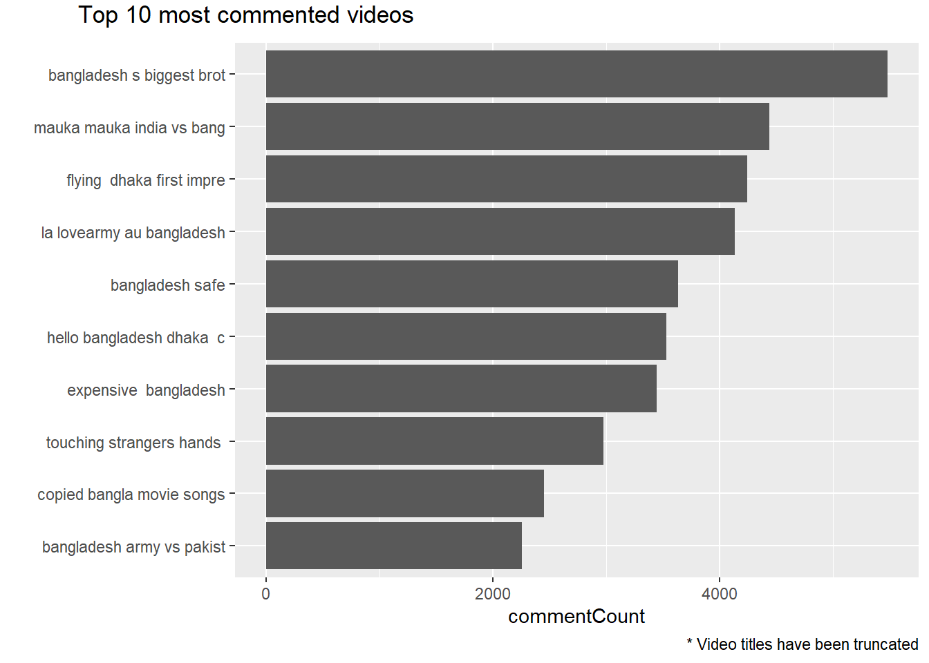
Looking at the most commented videos, as expected we can see some common names from the previous charts on most viewed, liked and disliked videos. But how does the relationship between comments and like or dislike look like? Do people comment more when they like the video or it’s opposite? To get an idea we will create consider ratio of like versus dislike and plot it on top of comment chart.
videos_year = videos_year %>% mutate(like_dislike = round(likeCount/dislikeCount),2)
videos_year %>% arrange(desc(commentCount)) %>% head(10) %>%
    mutate(title = strtrim(title, 25)) %>%
  mutate(title = reorder(title, commentCount)) %>%
  ggplot(aes(title, commentCount, fill = like_dislike)) + geom_col()+ xlab(label="")+ coord_flip() + ggtitle(label = 'Top 10 most commented videos with likes/dislike ratio') +
  scale_fill_continuous("Likes to Dislikes") +
  labs(caption = '* Video titles have been truncated')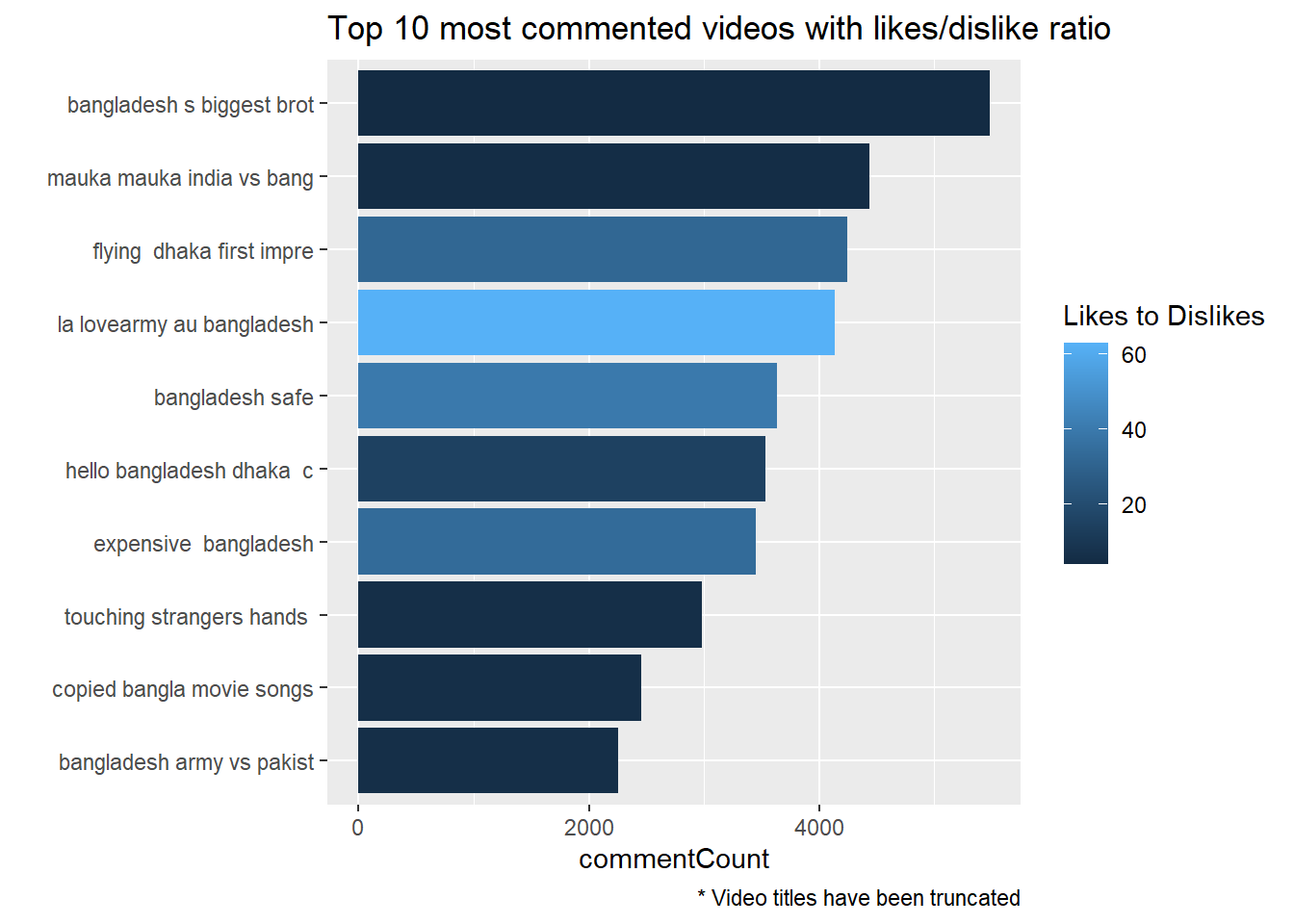
We can now immediately see the prevalence of extreme colors from both end (dark or very light blue). Which means that majority of the top most commented videos are either highly liked or extremely disliked (extremely dark or extremely light blue color).
Let’s now check both likes and dislikes and their relationship with the number of comments. To do that we will plot like and dislikes on a scatter plot and color code count of comments categorized.
videos_year %>% filter(dislikeCount <3000 & likeCount <20000) %>%
  mutate(comment_cat = ifelse(commentCount <= 1000, '< or = 1000',
                              ifelse(commentCount <= 2000, '1000 to 2000',
                                     ifelse(commentCount <= 3000, '2000 to 3000', 'above 3000')))) %>% drop_na() %>%
  ggplot(aes(likeCount, dislikeCount, color = comment_cat)) +
  geom_point(size = 3,alpha = 0.4)  +
  ggtitle(label = 'Likes vs Dislikes', subtitle = 'Videos with upper extreme values in likes and dislikes not considered') +
  scale_fill_discrete(name = 'Comment count category')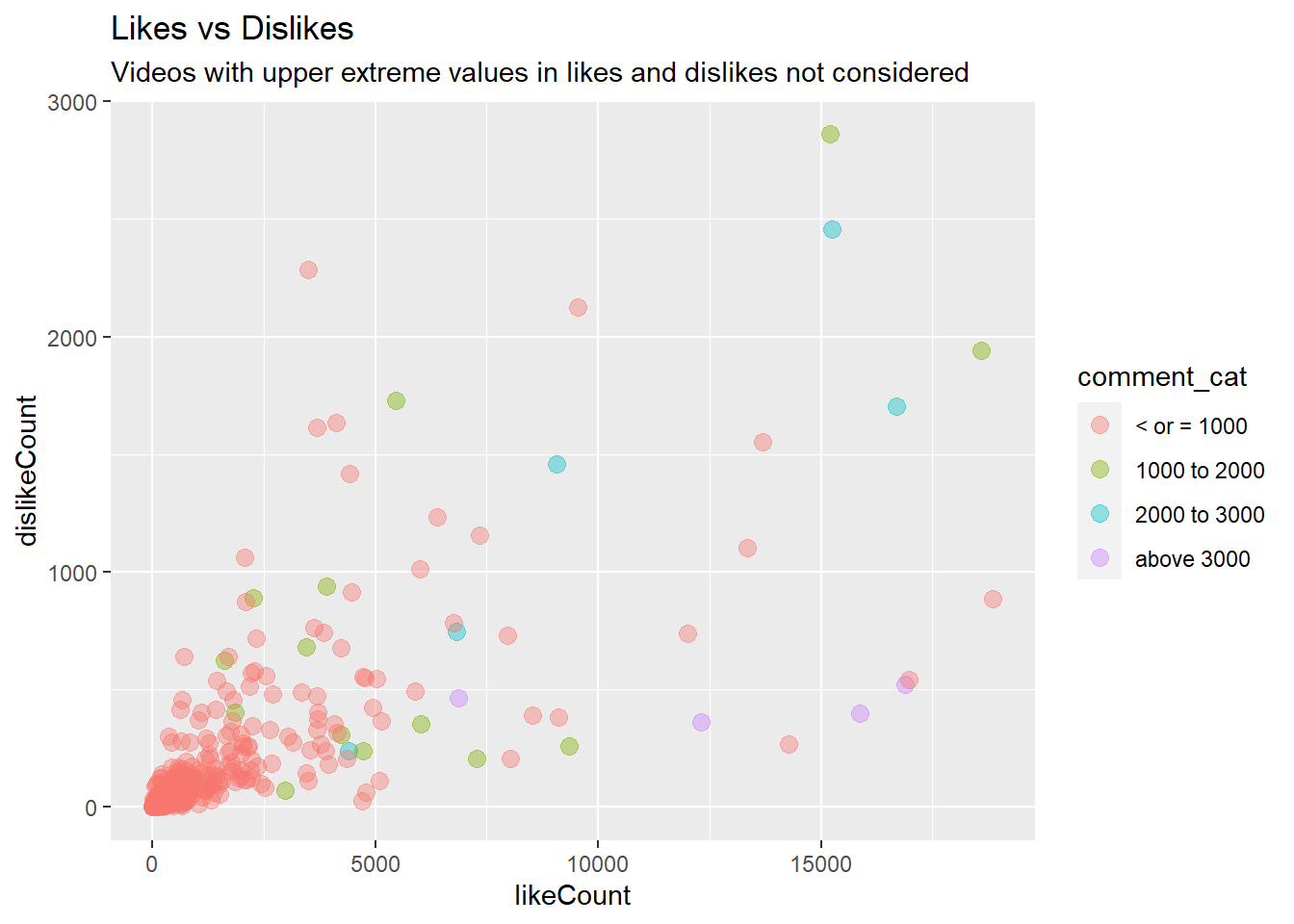
From the abundance of light red color on the above plot, we can immediately see that there are not a lot of videos that could generate more than 1000 comments. Anone take away from the plot is that videos with higher likes compared to dislikes generates most number of comments, above 3,000 (violet clor), while the videos with higher dislikes compared to likes have total comments of no more than 1000. Moreover, videos with both higher likes and dislikes generate moderately high number of comments, 1,000 to 2,000 (light green). Higher correlation between likes count and comment count (0.73) versus the lower correlation between dislike count and comment count (0.58) also reflects the possibility that video with higher likes tend to have higher number of comments too.
cor(videos_year$likeCount, videos_year$commentCount, use = 'complete')## [1] 0.7320702cor(videos_year$dislikeCount, videos_year$commentCount, use = 'complete')## [1] 0.5827611At this stage of our analysis we can move onto analyzing the comments a bit further. But due to restriction of the Youtube API on number of records that can be collected, the comments will be collected for only the selective videos. From our initial study on the video titles we have already seen some common areas topics or areas were frequntly presented such as dhaka, india, rohingya, cricket and dance. In the next phase of our analysis we’ll look into these areas except the videos related to dance, since we have already seen that these videos were mostly posted by one channel with insignificant and also didn’t gather much view.
To fetch comments of these selected topics, first of all all the videos in our list have been classified under these four cateogories: cricket, india, regugee, dhaka and dance. To do that total dataset has been subseted using words those have high correlation with the ‘key words’ which are rohingya, india, dhaka, cricket and dance in this case. In the next phase comments will be collected for the videos under these categoris and sentiment analysis will be conducted to draw insight about general sentiments expressed by the audiences around those topics.
videos_year=videos_year %>%
  mutate(labels = ifelse(grepl(paste(c("rohingya",'refugee','flee','myanmar'), collapse = '|'),title), 'rohingya',
                         (ifelse(grepl("dhaka",title), 'dhaka',
                                 (ifelse(grepl('skydance',title), 'dance',
                                      (ifelse(grepl(paste(c("india",'border','kolkata'),collapse = '|'),title), 'india',
                                              ifelse(grepl(paste(c('cricket','press','post','conference'), collapse = "|"), title),'cricket',NA )))))))))

videos_year=videos_year %>%
  mutate(labels = ifelse(grepl(paste(df1$words, collapse = '|'),title), 'rohingya',
                         (ifelse(grepl(paste(df2$words, collapse = '|'),title), 'dhaka',
                                 (ifelse(grepl('skydance',title), 'dance',
                                      (ifelse(grepl(paste(df4$words,collapse = '|'),title), 'india',
                                              ifelse(grepl(paste(df6$words, collapse = "|"), title),'cricket',NA )))))))))

summary(factor(videos_year$labels))
## cricket dance dhaka india rohingya NA's
## 23 38 15 22 36 455Among our total 589 videos from our initial videos, we could make a rough classification of 56 videos. We will further restrict the number of videos to be considered for analysis by taking only the top 10 commented videos from each topic. So that we can still be within the quota of the Youtube API.
# function to fetch comments of specific cateogry of video
fetchComments = function(dataset, keyword){
  df = dataset %>% filter(labels == keyword) %>%
    arrange(desc(commentCount)) %>% head(10)
  comments = lapply(as.character(df$video_id), function(x){
    get_comment_threads(c(video_id = x), text_format = 'plainText')
  })
  comments = ldply(comments, data.frame) %>% select(videoId, textDisplay, likeCount, publishedAt)
  comments$textDisplay = as.character(comments$textDisplay)
  comments$label = keyword

  return(comments)

}


comment_rohingya = fetchComments(videos_year, 'rohingya')
comment_cricket = fetchComments(videos_year, 'cricket')
comment_dhaka = fetchComments(videos_year, 'dhaka')
comment_india = fetchComments(videos_year, 'india')

video_comments = rbind(comment_rohingya,comment_india,comment_dhaka,comment_cricket)
# write.csv(video_comments,'video_comments_top10videos_four_categories.csv', row.names = FALSE)
video_comments=read.csv('../../../source_files/video_comments_top10videos_four_categories.csv')
summary(video_comments$label)## Length Class Mode
## 1990 character characterWe can see that there are total 1,990 comments collected where most comment generating video topics are rohingya, dhaka, cricket and india in descending order. As we did with our previous dataset of videos_year, we will follow similar steps to clean the date and text variables.
video_comments$publishedAt = as.Date(video_comments$publishedAt)
video_comments= video_comments %>% mutate(tidy_date = floor_date(publishedAt, unit = "month"))
summary(video_comments$tidy_date)
## Min. 1st Qu. Median Mean 3rd Qu. Max.
## "2017-02-01" "2017-09-01" "2017-11-01" "2017-11-25" "2018-03-01" "2018-07-01"In this case in addition to converting the date column, publishedAt, into proper date category, a new column of date has also been creted by converting the date values in publisheAt. The new column tidy_date contains date values grouped into 12 groups containing all dates clubbed under their respective month. For example, videos posted on Feb-01, Feb-19 have been clubbed under Feb-01 and so on. From the summary of this new variable above, we can see that we have records from as early as February 2017 and as late as July 2018.
# cleaning comments
head(video_comments$textDisplay,5)
## [1] "Thank god for Aung San Suu Kyi for doing this. I live in Yangon and I am so fed up with muslims acting like they own the world. They are cowards who need to stop their terrorist attacks, or else more of this will happen."
## [2] "You know west is weak, when even the budhists show more balls dealing with islam."
## [3] "Look out people. Evil George soros is using canadian government bob ray to make sure the slaughter continues"
## [4] "Humanity has no religion! Bhutanese cruel king n Indian Govt. sent more then 6 hundred thousand refugees to nepal in during 90s they r still in nepal . \nWelcome to nepal rohingya brothers n sister!!"
## [5] "George Soros is involved somewhere,i can smell his MO. If you want real news go to UK Column news.(yt)"video_comments$textDisplay <- iconv(video_comments$textDisplay, to = "ASCII", sub = " ") # convert to ASCII characters to remove any text written using anything other than plain english letter e.g. bengali words
video_comments$textDisplay= gsub("<.*?>","", video_comments$textDisplay) #removing html tags
video_comments$textDisplay= gsub("[[:punct:]]", " ", video_comments$textDisplay) #removing html tags
video_comments$textDisplay = gsub("[ |\t]{2,}", " ", video_comments$textDisplay) # Remove tabs
video_comments$textDisplay = gsub("^ ", "", video_comments$textDisplay) # Leading blanks
video_comments$textDisplay = gsub(" $", "", video_comments$textDisplay) # Lagging blanks
video_comments$textDisplay = gsub(" +", " ", video_comments$textDisplay) # General spaces
video_comments$textDisplay = tolower(video_comments$textDisplay) # lowering all letters
head(video_comments$textDisplay,5)## [1] "thank god for aung san suu kyi for doing this i live in yangon and i am so fed up with muslims acting like they own the world they are cowards who need to stop their terrorist attacks or else more of this will happen"
## [2] "you know west is weak when even the budhists show more balls dealing with islam"
## [3] "look out people evil george soros is using canadian government bob ray to make sure the slaughter continues"
## [4] "humanity has no religion bhutanese cruel king n indian govt sent more then 6 hundred thousand refugees to nepal in during 90s they r still in nepal \nwelcome to nepal rohingya brothers n sister"
## [5] "george soros is involved somewhere i can smell his mo if you want real news go to uk column news yt"# write.csv(video_comments,'cleaned_video_comments_top10videos_four_categories.csv', row.names = FALSE)Now moving onto the text cleaning step for the textDisplay column we have cleaned the html tags, lowered all letters, removed punctuation marks. Above we can see sample of texts before the transformation and after the transformation. The first five sentences in the above list shows the text before cleaning steps applied and last five shows the transforemd text after cleaning. Now we’ll calculate sentiment score for each of the sentences using different lexicon libraries. For the purpose, tidytext package will be used which offers the commonly used lexicon libraries (bing, afinn, nrc).
Before moving into the analysis of sentiment scores we’ll take a look at the trend of video posting. Naturally we expect to see videos in different topics being posted at different rate over the period of months.
# calculating labelwise trend of video posting
video_comments %>%
  group_by(tidy_date) %>%
  mutate(total_videos_month = n()) %>%
  ungroup() %>%
  count(tidy_date, label, total_videos_month) %>%
  mutate(percent_video_label = n/total_videos_month) %>%
  ggplot(aes(tidy_date, percent_video_label, color = label, group = 1)) +         facet_wrap(~label)+ geom_line(size = 1) +
  scale_x_date(date_labels="%b %y",date_breaks  ="2 month") +
  theme(axis.text.x=element_text(angle=45,hjust=1))+
  ggtitle(label = 'Month wise frequency of comments') +
  xlab(label = 'Month') +
  ylab(label = 'Percentage')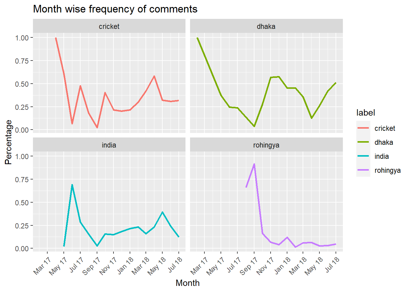
video_comments %>%
  group_by(tidy_date) %>%
  mutate(total_videos_month = n()) %>% # each row of video represent a single comment
  ungroup() %>%
  count(tidy_date, label, total_videos_month) %>%
  mutate(percent_video_label = n/total_videos_month) %>%
  ggplot(aes(tidy_date, percent_video_label, color = label)) +         facet_wrap(~label)+
  geom_point(shape = 21, fill = "white", color = "#27408b", size = 2, stroke = 1.1)+
  geom_line(color="#27408b") +
  scale_x_date(date_labels="%b %y",date_breaks  ="2 month") +
  theme(axis.text.x=element_text(angle=45,hjust=1))+
  ggtitle(label = 'Month wise frequency of comments') +
  xlab(label = 'Month') +
  ylab(label = 'Percentage')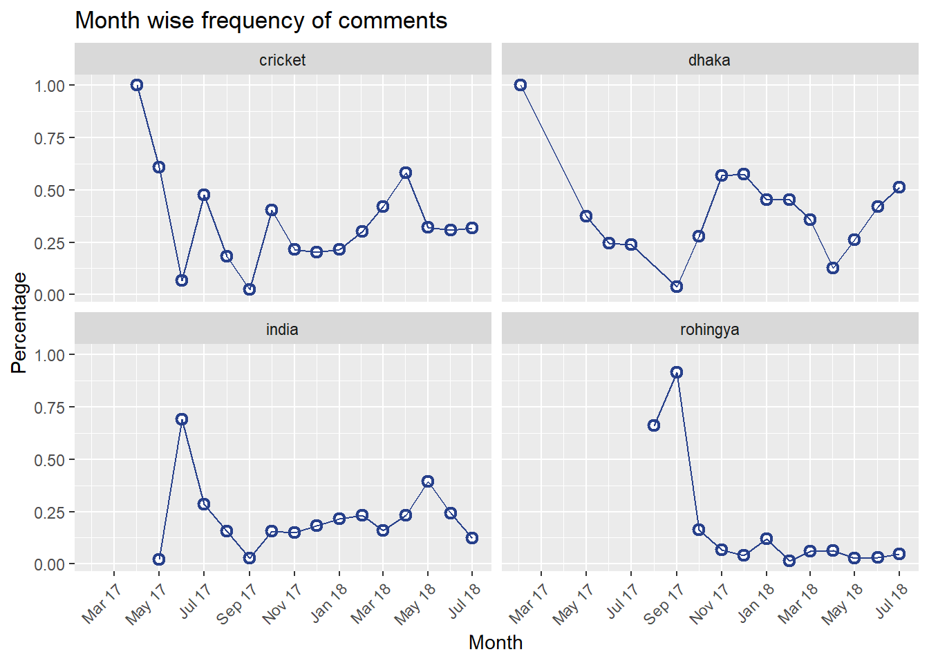
# video_comments %>% filter(tidy_date == '2017-06-01' & label == 'india') %>% select(videoId) %>% unique()One nice thing about the plot above is that, it captures the trend how social media activities spikes and then flattens with the time. For example, the videos posted about rohingya topic had the highest traction on September 2017 around the time when the crisis started. But gradually comments have slowed down since November 2017. On the other hand comments on videos about cricket and india show somewhat resemblance. Till September 2017 both the topics experienced spikes or in other words higher number of comments posted. Later on, the trend has slowed down. We may now look at the trend from the perspective of age of the videos. How did the sentiment of audiences of these videos changed over the life time of the videos? Or does sentiment change as the videos grow old?
# fetching video poblishing date from the old dataset
video_comments = video_comments %>% left_join(videos_year[,c('video_id','publishedAt')], by = c('videoId' = 'video_id'), suffix = c('_comment','_video'))
# creating new variable with the difference between video posting date and comment posting date
video_comments = video_comments %>%
  mutate(post_comm_gap = publishedAt_comment - publishedAt_video)

p1=video_comments %>%
  group_by(post_comm_gap) %>%
  mutate(total_videos = n()) %>%
  ungroup() %>%
  ggplot(aes(post_comm_gap, total_videos)) +
  facet_wrap(~label)+ geom_jitter() +
  theme(axis.text.x=element_text(angle=45,hjust=1))+
  labs(subtitle = 'All comments') +
  xlab(label = 'Age of comment') +
  ylab(label = 'Count')

p2=video_comments %>%
  group_by(post_comm_gap) %>%
  mutate(total_videos = n()) %>%
  ungroup() %>%
  filter(total_videos < 20) %>%
  ggplot(aes(post_comm_gap, total_videos)) +
  facet_wrap(~label)+ geom_jitter() +
  theme(axis.text.x=element_text(angle=45,hjust=1))+
  labs(subtitle = 'Less than 20 total comments') +
  xlab(label = 'Age of comment') +
  ylab(label = 'Count')

library(gridExtra)
grid.arrange(p1,p2, ncol = 2, top = 'Count of comments vs when they are posted')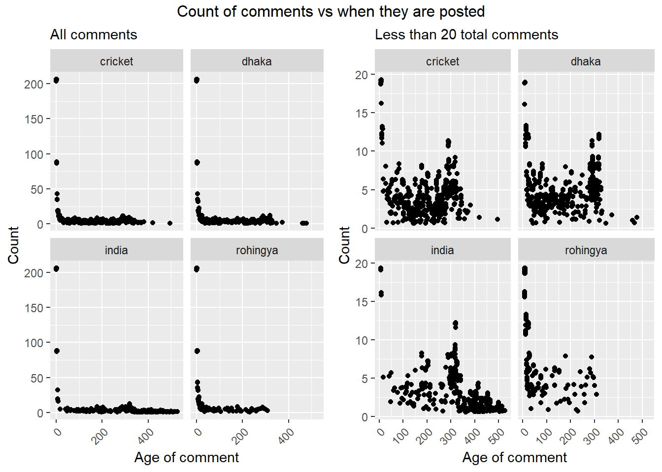
From left plot above, we can see that the highest number of comments are posted right after videos are posted (where age of video is ‘zero’ meaning video posted and comment posted dates are same). But since we can’t really make much sense out of the graphs because of the extremely skewed data on y axis, we can consider only the lower values to check if there is any specific trend. Doing that we ended up with the plot on right. Where y axis with less than 20 values were considered.
From the right plot above, we can see that on an average number of comments tend to slow down after 350 days from the date video posted but comments on videos about India seemingly can keep this traction going on further. While the videos about Rohingya issue doesn’t have any comments after 300th days. Which largely because that the oldest video considered here about Rohingya was posted on August 2017. Which barely gives a life span of slightly more than 300 days While in other topics there are videos from the very first month of 2007. But from the trend of comments in other topics we can assume that the comments under the existing videos about rohingya crisis may also take a gradual down turn soon!
Now moving on to the sentiment analysis, we’ll use lexicon based approach. To do that we will look at the comments that viweres left below these videos. We will calculate sentiment score using lexicon library NRC. To explain briefly what a lexicon is, lexicon libraries are stock of words that are prelabeled with the sentiment that they carry. For example: happy would be labeled as positive sentiment while cry as negative sentiment. In The bing lexicon categorizes words in a binary fashion into positive and negative categories.
# creating a new column with the words
video_comments$textDisplay = as.character(video_comments$textDisplay)
token = video_comments %>%
  unnest_tokens(word, textDisplay, token = 'words', drop = FALSE)

token %>% select(label, tidy_date, word) %>%
  inner_join(get_sentiments('nrc'), by = 'word') %>%
  group_by(label,tidy_date) %>%
  mutate(label_month_total = n()) %>%
  ungroup() %>%
  group_by(label,sentiment,tidy_date) %>%
  mutate(label_month_senti_total = n()) %>%
  ungroup() %>%
  mutate(percent_sentiment = label_month_senti_total/label_month_total) %>% select(label, tidy_date, sentiment, percent_sentiment) %>% unique() %>%
  ggplot(aes(tidy_date, percent_sentiment, color = factor(sentiment))) + geom_line(size = 1) + facet_wrap(~label) + theme(axis.text.x=element_text(angle=45,hjust=1)) +
  labs(title = 'Different sentiment trending over the time', x = 'Date', y = 'Percentage', colour = "Sentiments")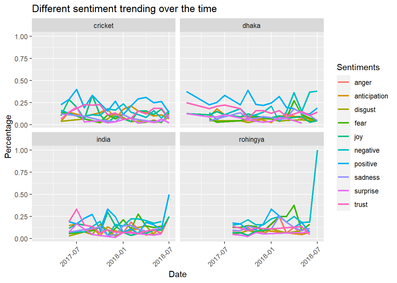
# nrc = get_sentiments('nrc')
# summary(factor(nrc$sentiment))
The plots above shows all the sentiments available in the NRC lexicon, which presents an immediate challenge: too cluttered lines to interprete. To make it legible we can club the negative and positive sentiments and plot separtely. But before we do that, if we look back to the plot and try to interprete the lines, we immediately see that there is a prevalence of positive sentiment. Which is because of the nature of the lexicon library. Majority of the words are classified or labeled as positive words which is reflected in the above plot too.
p1 = token %>% select(label, tidy_date, word) %>%
  inner_join(get_sentiments('nrc'), by = 'word') %>%
  filter(sentiment %in% c('anger','disgust','fear','sadness','negative')) %>%
  group_by(label,tidy_date) %>%
  mutate(label_month_total = n()) %>%
  ungroup() %>%
  group_by(label,sentiment,tidy_date) %>%
  mutate(label_month_senti_total = n()) %>%
  ungroup() %>%
  mutate(percent_sentiment = label_month_senti_total/label_month_total) %>% select(label, tidy_date, sentiment, percent_sentiment) %>% unique() %>%
  ggplot(aes(tidy_date, percent_sentiment, color = factor(sentiment))) + geom_line(size = 1) + facet_wrap(~label) + theme(axis.text.x=element_text(angle=45,hjust=1)) +
  labs(title = 'Negative sentiments trending over the time', x = 'Date', y = 'Percentage', colour = "Sentiments") +
  scale_x_date(date_labels="%b %y",date_breaks  ="2 month")

p2 = token %>% select(label, tidy_date, word) %>%
  inner_join(get_sentiments('nrc'), by = 'word') %>%
  filter(!sentiment %in% c('anger','disgust','fear','sadness','negative')) %>%
  group_by(label,tidy_date) %>%
  mutate(label_month_total = n()) %>%
  ungroup() %>%
  group_by(label,sentiment,tidy_date) %>%
  mutate(label_month_senti_total = n()) %>%
  ungroup() %>%
  mutate(percent_sentiment = label_month_senti_total/label_month_total) %>% select(label, tidy_date, sentiment, percent_sentiment) %>% unique() %>%
  ggplot(aes(tidy_date, percent_sentiment, color = factor(sentiment))) + geom_line(size = 1) + facet_wrap(~label) + theme(axis.text.x=element_text(angle=45,hjust=1)) +
  labs(title = 'Positive sentiments trending over the time', x = 'Date', y = 'Percentage', colour = "Sentiments")+
  scale_x_date(date_labels="%b %y",date_breaks  ="2 month")

grid.arrange(p1,p2, ncol = 2)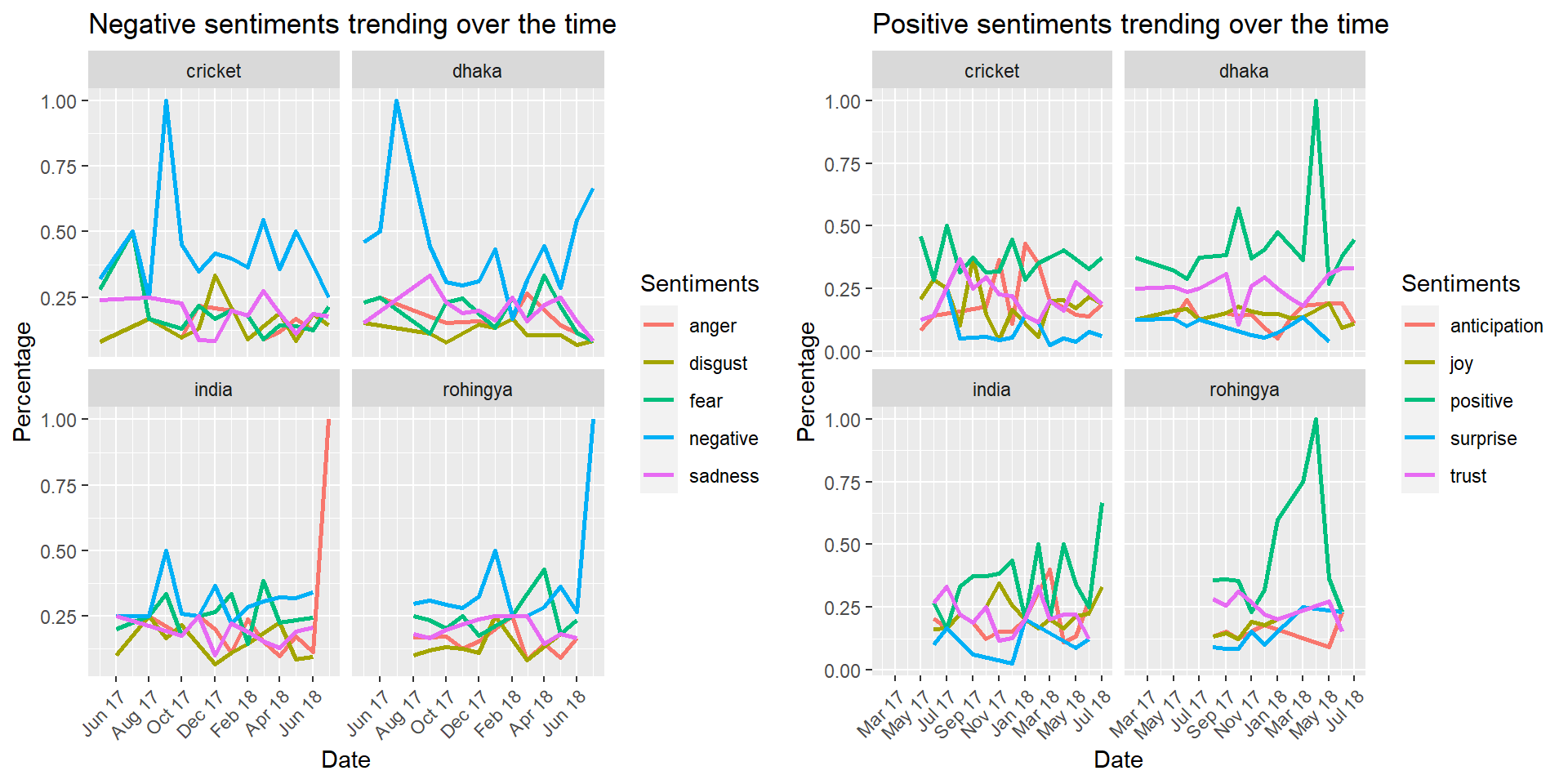
Looking at the left plot two interesting trends can be spotted: * About India there has been a sudden growth of anger during the months of June and July 2018. * On the other hand surprisingly negative sentiment about the Rohingya issue is growing on the months of June and July 2018.
Plot on the right kind of reflects the sentiments expressed on the left plot. Where we see a hightened positivity about Dhaka and Rohingya on April 2018.
We are at the very end of our analysis. We will wrap it up with network charts, created with the most frequent words (noun and adjectives), on the comments about India and Rohingya in recent times (after June 2018). From these plots we will try to make a sense about the areas where the unusual spike of negative sentiments were expressed.
#key words extraction from the advising notes
ud_model = udpipe_download_model(language = 'english')
ud_model = udpipe_load_model(ud_model$file_model)

net_plot = function(dataset,label_name,sg) {
  text = dataset %>% filter(label == label_name)
  text = text %>% filter(publishedAt_comment > "2018-06-01")
  text = udpipe_annotate(ud_model, x = text$textDisplay)
  text = as.data.frame(text)
  text$lemma = removeWords(text$lemma, stopwords('english'))
  text$lemma = removePunctuation(text$lemma)
  text = text %>% filter(lemma != "")
  stat = cooccurrence(x = subset(text, upos %in% c('NOUN','ADJ')), term = 'lemma',
                      group = c("doc_id", "paragraph_id", "sentence_id"), skipgram = sg)
  wordnetwork <- head(stat,50)
  wordnetwork <- graph_from_data_frame(wordnetwork)
  plot = ggraph(wordnetwork, layout = "fr") +
    geom_edge_link(aes(width = cooc, edge_alpha = cooc), edge_colour = 'red') +
    geom_node_text(aes(label = name), col = "darkgreen", size = 4) +
    theme_graph(base_family = "Arial Narrow") +
    theme(legend.position = "none") +
    labs(title = 'Cooccurrent Nouns and Adjectives',
         subtitle = label_name)
  return(plot)
}

# net_plot(video_comments, 'dhaka',2)
# net_plot(video_comments, 'cricket',2)

p1=net_plot(video_comments, 'rohingya',2)
p2=net_plot(video_comments, 'india',1)

grid.arrange(p1,p2,ncol = 2, top = 'Word networks')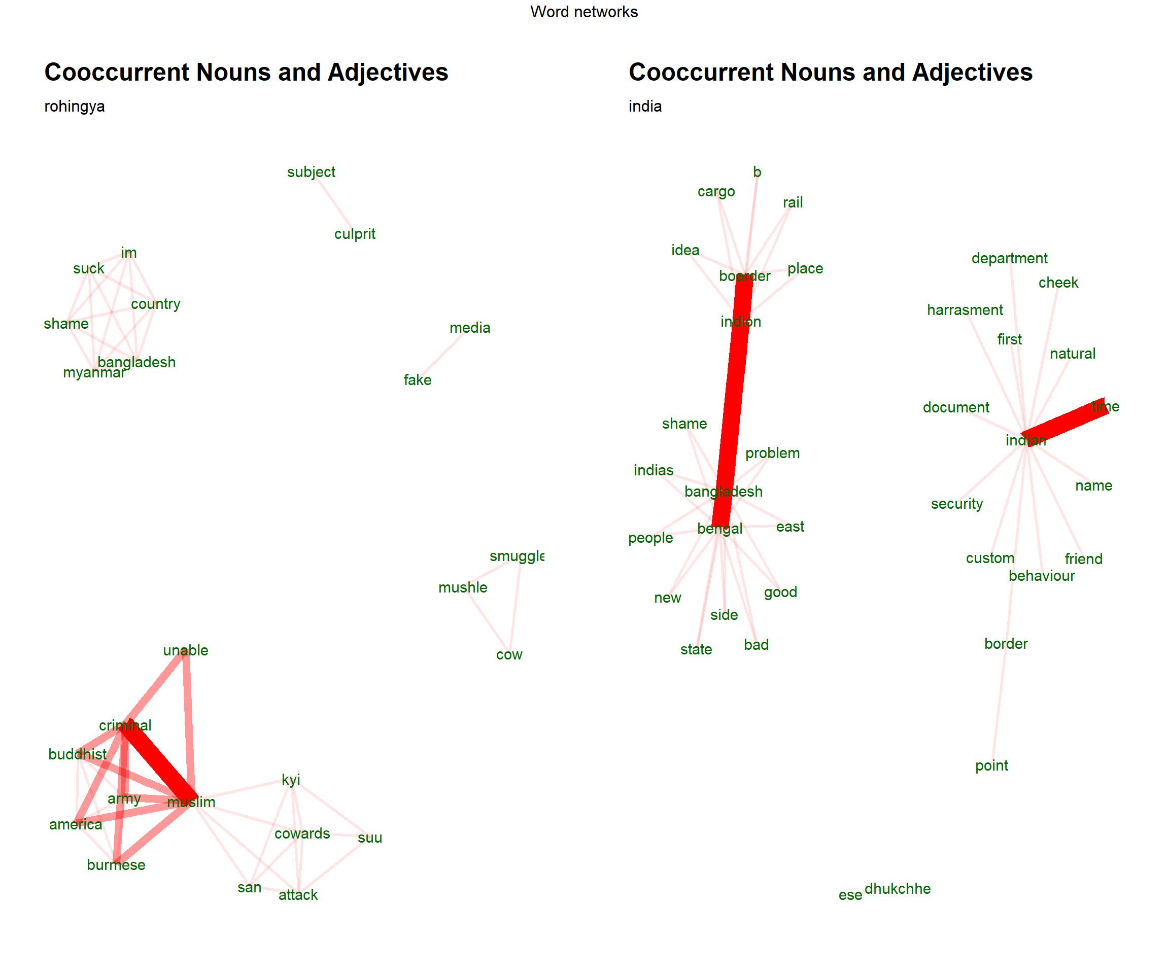
From the word network on left we observe that some most frequent phrases are related to muslim such as muslim criminal, muslim burmese and so on. From which it can be assumed that the negativity related to rohingya issue is mostly about the plight of them which may have been triggered by their muslim majority. On the other hand, most frequent phrases around the topic of India are bangladesh border, bangladesh people and so on. Where aparently no specific indication is present from which we can make any assumption about the sudden increase of anger.
Part 05: Ending
From our overall analysis, we have seen that videos with high number of views tend to be about issues that evoke some sort of controverysy (e.g. prank video and videos about brothel in top 20 videos). Interestingly videos that generates higher number of likes also generates higher shares of dislikes too (correlation of 0.6). And when we consider comments as a matrix of viewer traction, most commented videos tend to be on the extremes of likes or dislikes. But most liked videos tend to have higher number of comments compared to the videos with higher number of dislikes. Further we have observed that the videos posted were mostly about some specific areas. From which we picked four topics to explore further. The number of comments vary following different trends in each of the topic areas. Where we have seen that videos realted to India had the longest traction or kept generating comments over a longer period of time. But overall videos seem to reach their end of customer traction at around 350 to 400 days from the day when they are first posted. In the end we looked at the sentiment expressed in the comments by the viewers. Overall, we saw uneven distribution of sentiments over the time. But for some reason we have seen a prevalence of anger about the topic India and negativity about the topic Rohingya in comments in recent time. And as a possible source of recent increase in negative sentiment aroun rohingya topic we indentified the plight of rohingya muslims.
Comment