Background
Last week’s TidyTuesday was all about wealth inequality in the United States. Since I work for a university, I have seen how students’ success varies among races. Looking back at their socio-economic backgrounds makes it quite obvious that wealth, hidden behind their races, plays its role in their success. That makes the student debt data an interesting case for me to look into.
So here’s the outcome of that: an animated graph that will show you how America’s races have historically been different in their student debt accumulation and how it’s getting worse increasingly.
Data
As said earlier, the data comes from TidyTuesday. Here’s the detail about the data.
# libraries
# devtools::install_github("thomasp85/transformr")
library(ggplot2)
library(tidyverse)
library(ggtext)
library(gganimate)
library(extrafont)
library(knitr)
library(kableExtra)

# data
student_debt <- readr::read_csv('https://raw.githubusercontent.com/rfordatascience/tidytuesday/master/data/2021/2021-02-09/student_debt.csv')

# glimpse of the data
student_debt %>%
  head(5) %>%
  knitr::kable(caption = "Top 5 lines of the data") %>%
kable_classic(full_width = F, html_font = "Cambria")| year | race | loan_debt | loan_debt_pct |
|---|---|---|---|
| 2016 | White | 11108.410 | 0.3367511 |
| 2016 | Black | 14224.770 | 0.4183588 |
| 2016 | Hispanic | 7493.999 | 0.2189689 |
| 2013 | White | 8363.605 | 0.2845555 |
| 2013 | Black | 10302.660 | 0.4122773 |
One great thing about this data is it’s already cleaned! To know more about the cleaning steps, feel free to go to the documentation here. Here’s a short description of the data:
| variable | class | description |
|---|---|---|
| year | double | Year of measure |
| race | character | Racial group |
| loan_debt | double | Loan debt |
| loan_debt_pct | double | Share of families with student loan debt |
Making an Animated Plot One plot at a time
I will use gganimate package to plot the plot. Before using gganimate we will first make a plot that we like using ggplot, the mighty data viz package from R. In the following code blocks and subsequent paragraphs I will walk you through step by step on how to do that.
A static line plot
Let’s start with a very simple line graph that will show the yearly trend of student debt in different races. This plot will work as the skeleton on top of which we’ll keep adding new layers and additional bells and whistles to make it nicer and meaningful.
student_debt %>%
  ggplot(
    aes(x = year,
        y=loan_debt,
        group = race)
  ) +
    geom_line()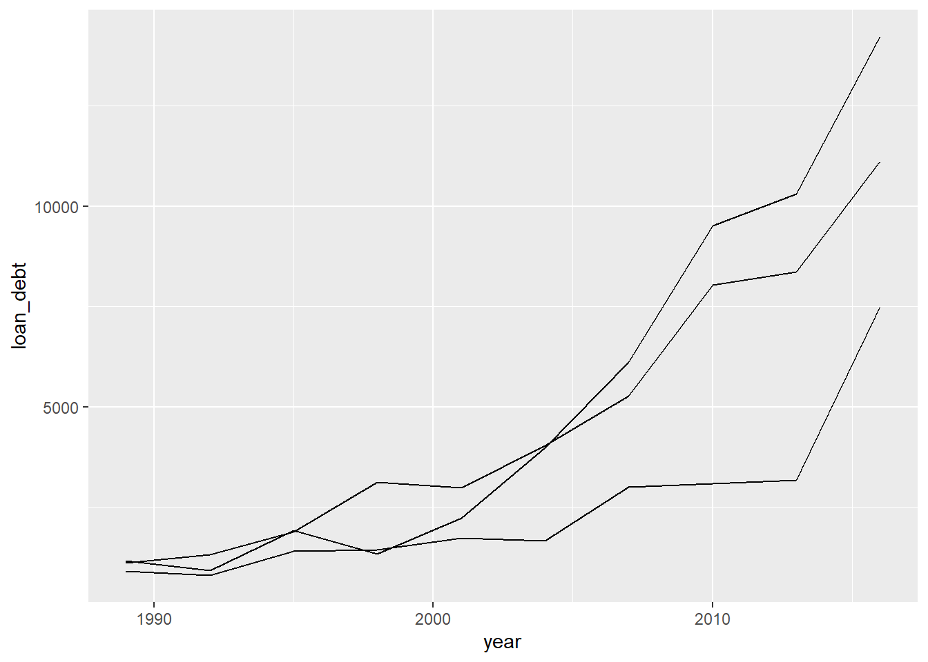
Some immediate improvement points are:
- Adding a title and labeling the axis,
- Separating lines with distinct colors,
- The default values on the x and y axes are not very meaningful. Breaking down the x and y axes values might make them more meaningful.
student_debt %>%
  ggplot(
    aes(x = year,
        y=loan_debt,
        group = race)
  ) +
  geom_line(aes(color = race)) +
  scale_x_continuous(breaks = seq(1989, 2016, 3)) +
    scale_y_continuous(breaks = seq(500, 15000, 1500),
                       labels = scales::dollar) +
  labs(title="Average Family Student Loan",
         x = NULL, color = NULL, y = "Average Loan Debt")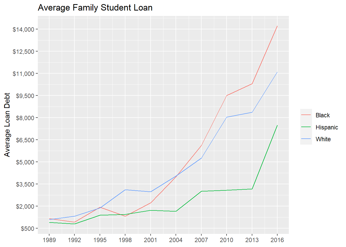
Quite an improvement!
A plot with additional insight
We have one yet unused but very crucial piece of data available to us - loan_debt_pct: percent of families with student loan debt. We can add that insight to our plot by using the newly added points!
student_debt %>%
  ggplot(
    aes(x = year,
        y=loan_debt,
        group = race)
  ) +

  geom_line(aes(color = race)) +

  geom_point(aes(
    size = loan_debt_pct)
             ) +


  scale_x_continuous(breaks = seq(1989, 2016, 3)) +
    scale_y_continuous(breaks = seq(500, 15000, 1500),
                       labels = scales::dollar) +
  labs(title="Average Family Student Loan",
         color = NULL,
         x = NULL, y = "Average Loan Debt",
         subtitle ="Point sizes represent % of families with student loans")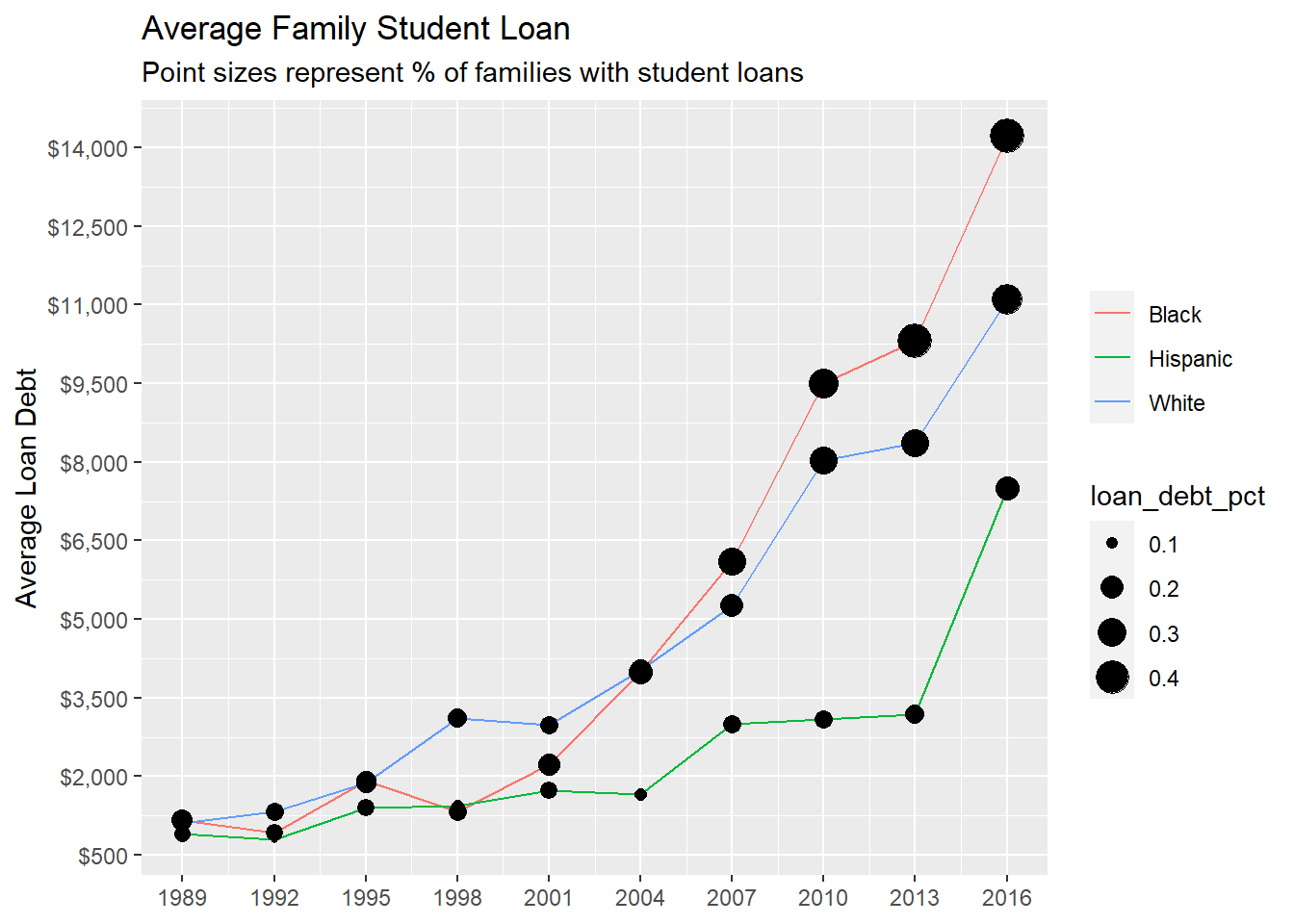
Now let’s make some more improvements:
- The color of the points on different lines represents the corresponding race. Let’s make that clear by having the same color as the lines,
- While doing that, let’s also change the colors from auto-generated
ggplotcolors to our custom colors (e.g. black for Blacks, white for Whites, and brown for Hispanics), - The sequence of the legends for the race variable is also not aligned with the sequence of the lines on the graph. Let’s rearrange the legends too,
- The size legend also needs some reworking. Since it’s tough to measure the size of circles just from a view, let’s take those legends out and rather call out actual percents on the plot.
student_debt %>%
  mutate(race = fct_relevel(race, "Black", "White", "Hispanic")) %>%
  ggplot(
    aes(x = year,
        y=loan_debt,
        group = race,
        color = race)
  ) +

  geom_line(aes()) +

  geom_point(aes(
    size = loan_debt_pct),
    show.legend = FALSE) +

  geom_text(aes(
    label = paste0(round(loan_debt_pct * 100, 2), "%")
  ),
  show.legend = FALSE,
  hjust = 1, vjust = 0) +

  scale_x_continuous(breaks = seq(1989, 2016, 3)) +
    scale_y_continuous(breaks = seq(500, 15000, 1500),
                       labels = scales::dollar) +
  scale_color_manual(values = c("White" = "#ffffff", "Black" = "#787575", "Hispanic" = "#f5bf42")) +

  labs(title="Average Family Student Loan",
         color = NULL,
         x = NULL, y = "Average Loan Debt",
         subtitle ="Point sizes represent % of families with student loans")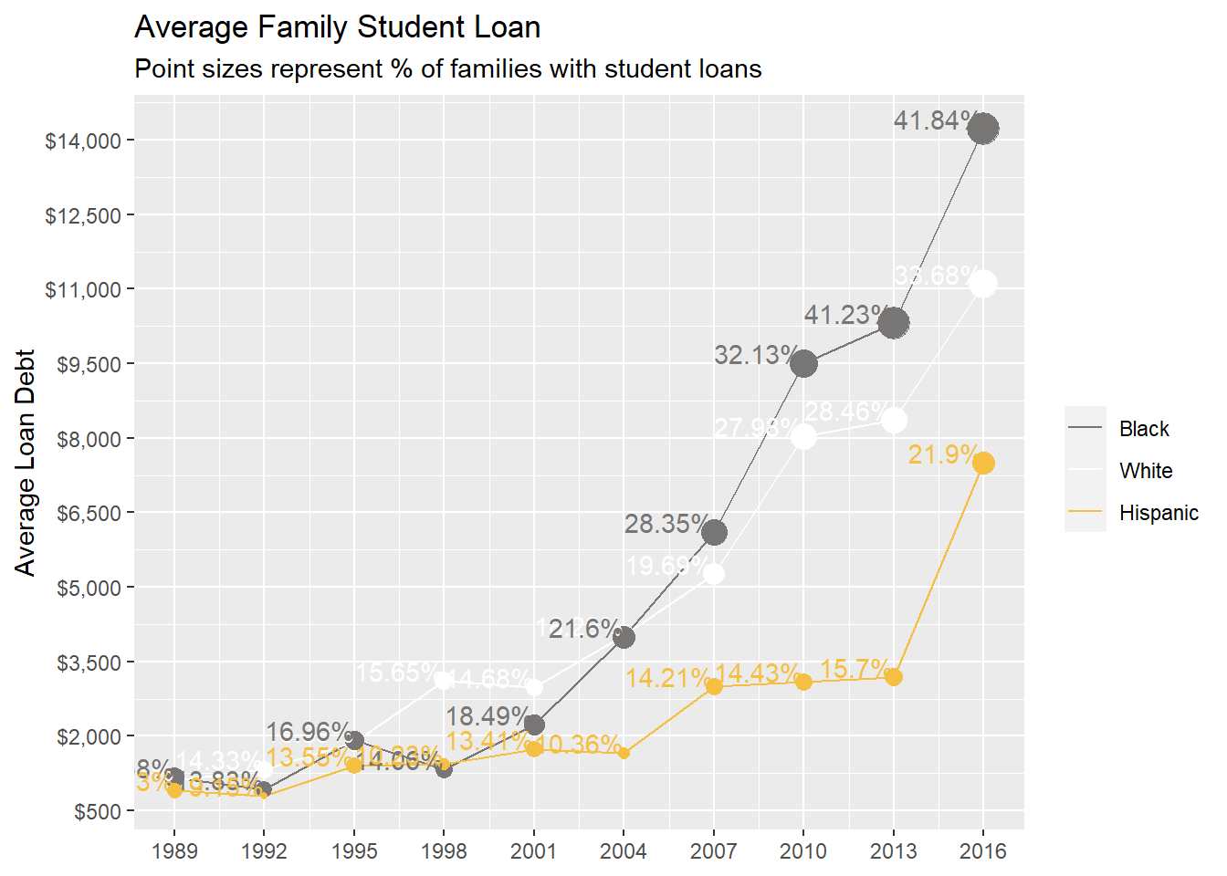
Making it visually appealing
Our chart is almost ready; content-wise. But visually it can be much better. The colors are not blending well on the default ggplot background. To make it better I modified theme_dark() from ggplot and created a customized these for this plot. Since this tutorial is not about ggplot theme, I’ll not discuss much on the theme here. That will be part of another tutorial in the future. But in case you are interested to play with ggplot theme here’s a good tutorial that I recommend.
In the iteration of the plot we’ll make the following changes:
- Change the default theme to a darker theme,
- Adjust line style to match the dark theme,
- To make the percent point texts less cluttered, let’s also make them appear only for the last three years.
student_debt %>%
  mutate(race = fct_relevel(race, "Black", "White", "Hispanic")) %>%
  ggplot(
    aes(x = year,
        y=loan_debt,
        group = race,
        color = race)
  ) +

  geom_line(aes(),
            size = 1,
            linetype = "dashed") +

  geom_point(aes(
    size = loan_debt_pct),
    show.legend = FALSE) +

  geom_text(aes(
    label = ifelse(year >= 2010,
                   paste0(round(loan_debt_pct * 100), "%"),
                   "")
    ),
  show.legend = FALSE,
  size = 4,
  hjust = 1, vjust = 0) +

  theme_race() +

  scale_x_continuous(breaks = seq(1989, 2016, 3)) +
    scale_y_continuous(breaks = seq(500, 15000, 1500),
                       labels = scales::dollar) +
  scale_color_manual(values = c("White" = "#ffffff", "Black" = "#787575", "Hispanic" = "#f5bf42")) +

  labs(title="Average Family Student Loan",
         color = NULL,
         x = NULL, y = "Average Loan Debt",
         subtitle ="Point sizes represent % of families with student loans")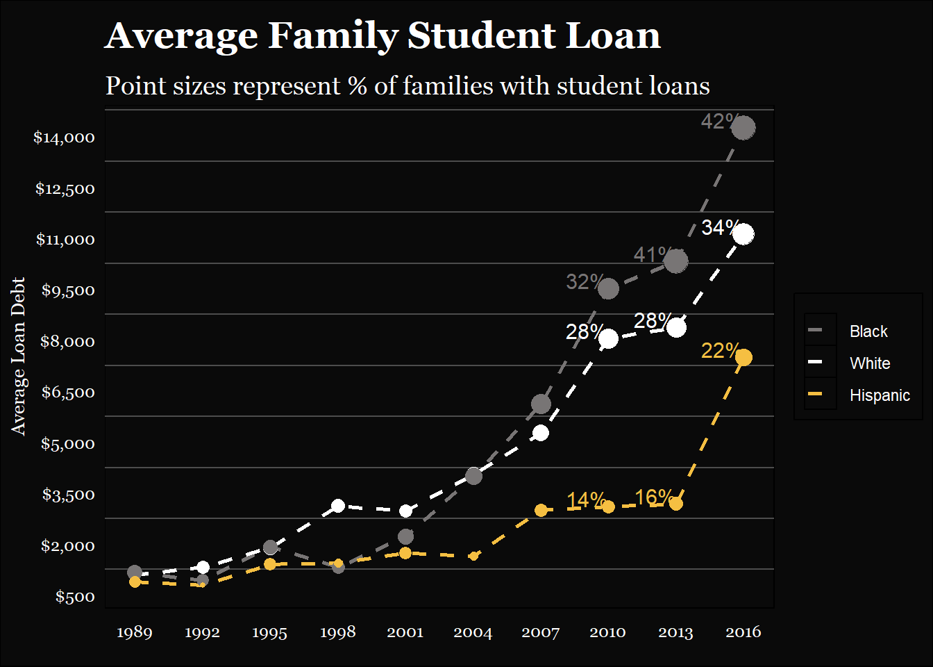
Let’s make the plot move!
I think we are in a good enough state to move on to making the plot animated. Animating the graph is pretty easy using gganimate. We will add ~2 lines of codes to make it.
student_debt %>%
  mutate(race = fct_relevel(race, "Black", "White", "Hispanic")) %>%
  ggplot(
    aes(x = year,
        y=loan_debt,
        group = race,
        color = race)
  ) +

  geom_line(aes(),
            size = 1,
            linetype = "dashed") +

  geom_point(aes(
    size = loan_debt_pct),
    show.legend = FALSE) +

  geom_text(aes(
    label = ifelse(year >= 2010,
                   paste0(round(loan_debt_pct * 100), "%"),
                   "")
    ),
  show.legend = FALSE,
  size = 4,
  hjust = 1, vjust = 0) +

  theme_race() +

  transition_reveal(year) +

  scale_x_continuous(breaks = seq(1989, 2016, 3)) +
    scale_y_continuous(breaks = seq(500, 15000, 1500),
                       labels = scales::dollar) +
  scale_color_manual(values = c("White" = "#ffffff", "Black" = "#787575", "Hispanic" = "#f5bf42")) +

  labs(title="Average Family Student Loan",
         color = NULL,
         x = NULL, y = "Average Loan Debt",
         subtitle ="Point sizes represent % of families with student loans")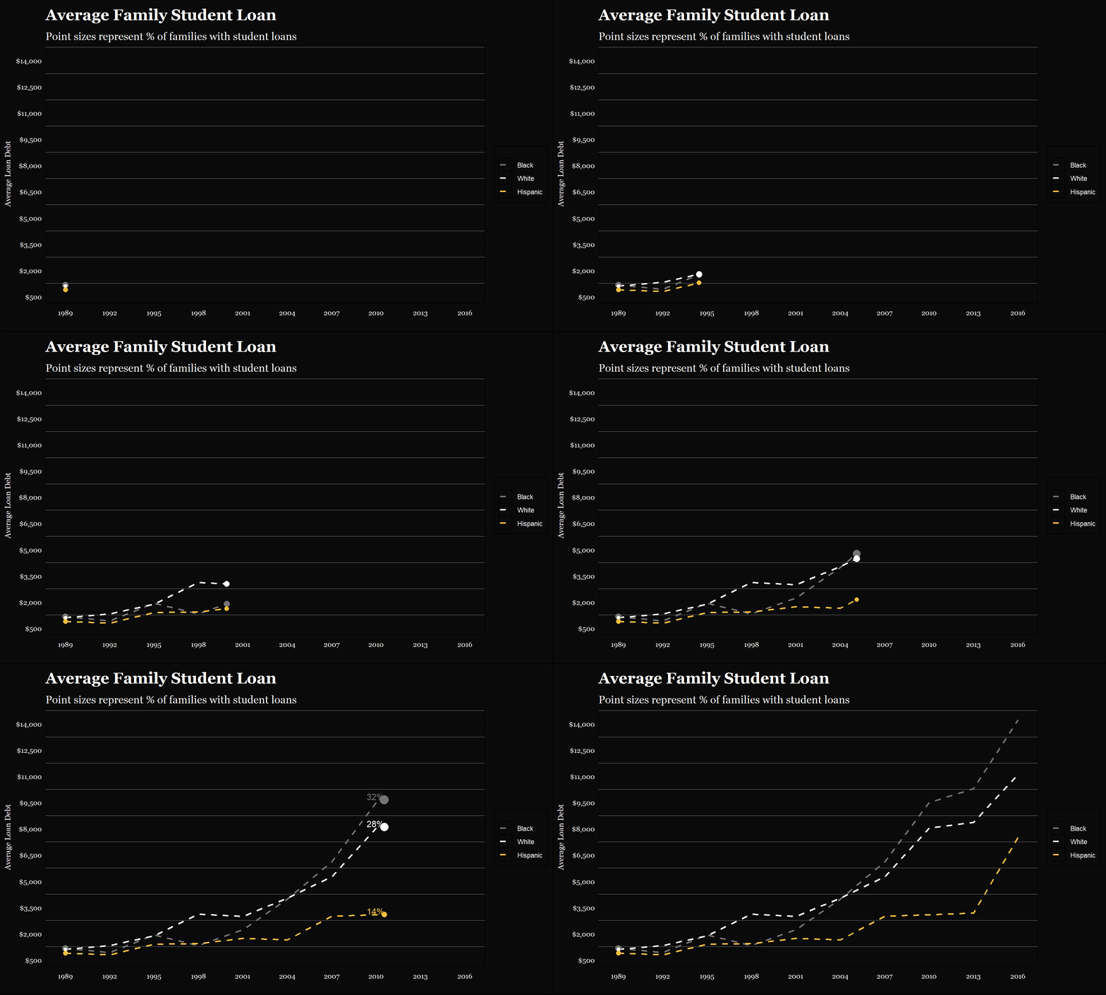
In our animation, two areas need improvements to make the visual more reader-friendly:
- The points and texts are disappearing as soon as the new data point is populated. Let’s make them stay,
- The animation is running and recycling too fast. Let’s slow it a bit and make it take a longer pause after it’s finished one cycle,
- Let’s add a counter on top of the chart that will show the current year as the plot moves,
- And as a final brush up, let’s also add some more clarity for the labels and add a source credit.
student_debt %>%
  mutate(race = fct_relevel(race, "Black", "White", "Hispanic")) %>%
  ggplot(
    aes(x = year,
        y=loan_debt,
        color = race)
  ) +

  geom_line(aes(),
            size = 1,
            linetype = "dashed") +

  geom_point(aes(
    size = loan_debt_pct,
    group = seq_along(year)),
    show.legend = FALSE) +

  geom_text(aes(
    label = ifelse(year >= 2010,
                   paste0(round(loan_debt_pct * 100), "%"),
                   ""),
    group = seq_along(year)
    ),
  show.legend = FALSE,
  size = 4,
  hjust = 1, vjust = 0) +

  theme_race() +

  transition_reveal(as.integer(year)) + # as.integer(year) makes the year showing in subtitle as integer.

  scale_x_continuous(breaks = seq(1989, 2016, 3)) +
    scale_y_continuous(breaks = seq(500, 15000, 1500),
                       labels = scales::dollar) +
  scale_color_manual(values = c("White" = "#ffffff", "Black" = "#787575", "Hispanic" = "#f5bf42")) +

  labs(title="Average Student Loan Taken by the US Families",
       x = NULL, color = NULL,
       y = "Average Loan Debt \n($ normalized to 2016 dollars)",
       caption = "Source: Urban Institute, and the US Census,\n2017 | Arafath Hossain",
       subtitle ="Point sizes represent % of families with student loans \nYear: {frame_along}") -> plot
Final Visual
So, after all those updates, here’s our final visual that takes us on a journey to one perpetuating aspect of the racial inequality in the US.
plot %>%
  animate(fps = 8, end_pause = 12, height = 6, width = 10, units = "in", res = 150)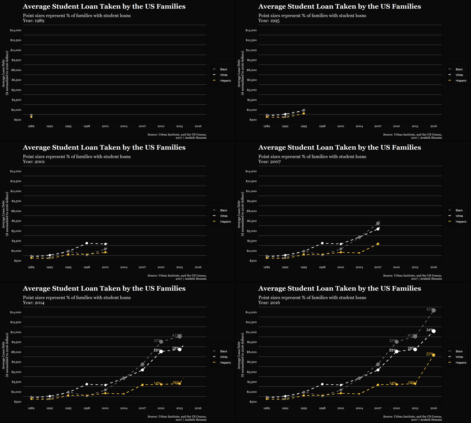
Plot animation can be a nice tool to convey your message when it comes about calling out a specific trend over time. I had fun working on this plot and hope you find it fun and useful too in your projects!
comments powered by Disqus Comment